How to Design a Nonprofit Logo + 8 Examples to Inspire You
It’s no secret that nonprofits like yours need community support to thrive. Advancing your organization’s mission and fostering lasting, positive change hinges on establishing meaningful connections with your donors, volunteers, advocates, and stakeholders. To accomplish this, you need to build recognition and trust with these groups.
This is where your nonprofit’s branding comes into play. Each aspect of your brand, from your colour palette and typography to imagery and messaging, serves to differentiate your organization from others and convey its values to your audience. Because your logo serves as the focal point of your brand, it’s essential to craft it with care to ensure it authentically embodies your nonprofit’s identity.
In this guide, you’ll learn all you need to know to create a meaningful, impactful logo for your organization, including:
Let’s get started with an overview of your logo’s purpose as it relates to your nonprofit’s goals.
What is a nonprofit logo?
Your nonprofit logo is the visual representation of your organization’s identity. It translates your mission, vision, and values into a graphic that encapsulates who you are, what you stand for, and the impact you strive to make. This graphic could be composed of typography (a wordmark), an image (a symbol mark), or both (a combination mark), depending on what might resonate best with your community.
For-profit organizations leverage their logos to market their products or services effectively. Take, for example, the Nike “swoosh” or the Apple symbol, which are known for their associations with quality and performance in the fields of athleticwear and technology.
While your nonprofit may not sell products or services, you need to effectively demonstrate your impact to your audience to inspire them to get involved. When supporters encounter your organization’s logo, whether featured in a social media post or displayed on your website’s donation page, they immediately associate it with your mission. This recognition instills trust, reassuring supporters that they are actively making a difference in the world by taking action.
8 Standout Nonprofit Logo Examples
As you dive into creating your nonprofit’s logo, exploring the designs that other organizations use can provide valuable inspiration and insights into how best to represent your mission.. Here are our top ten picks for nonprofit logos to help you get started.
1. WWF
WWF (formerly the World Wildlife Fund) has one of the most iconic nonprofit logos in the world. Since 1961, WWF has worked tirelessly to conserve land and protect threatened species in nearly 100 countries. The organization’s logo has prominently featured one of these species from the outset: the giant panda.
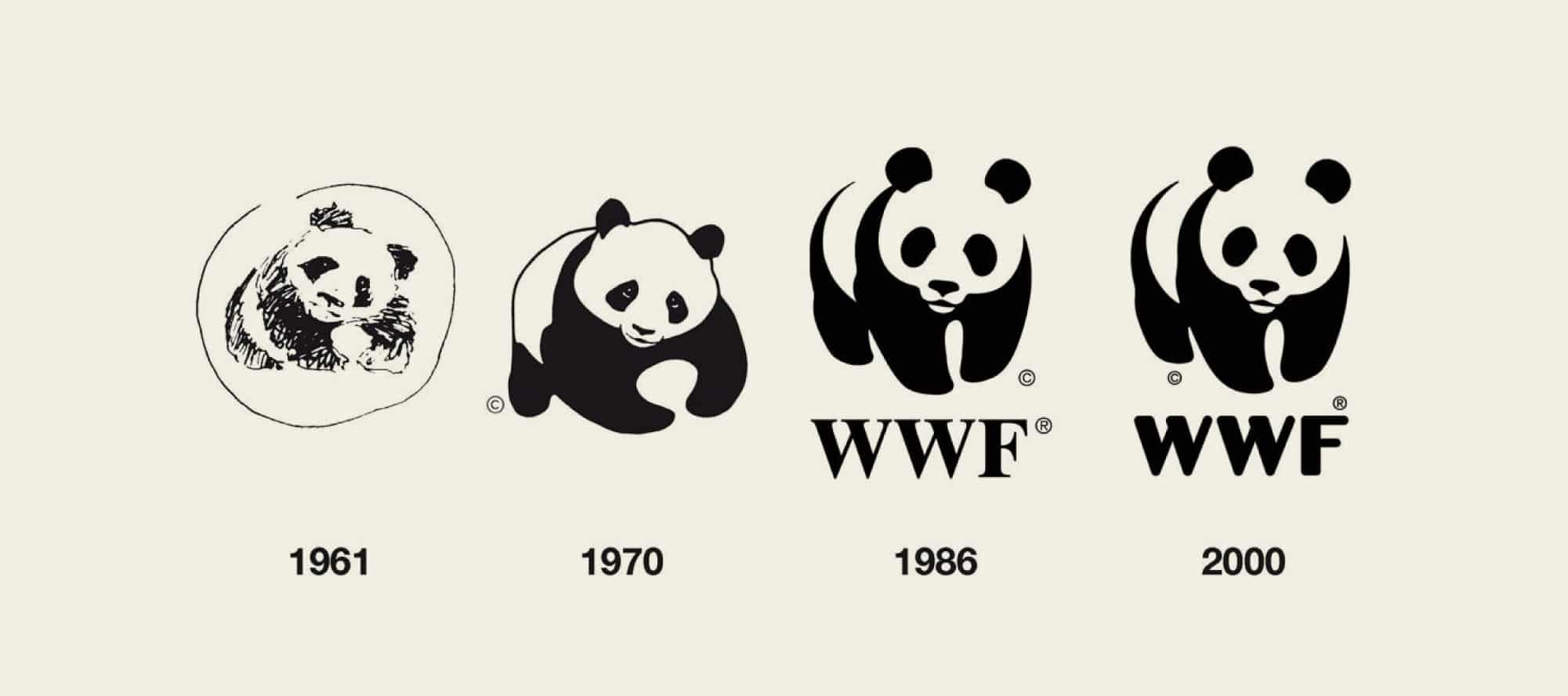
Throughout its evolution, the WWF logo has changed from a symbol mark to a combination mark, and its graphic style has been optimized for the digital world. Every iteration has featured the panda, ensuring the logo remains recognizable and continues to centre the organization’s mission. The black-and-white colour scheme and distinct font used in the logo is consistent with those used across WWF’s branded communications.
2. Oxfam
Oxfam is a people-centric organization that brings together individuals in more than 70 countries to fight inequity, poverty, and injustice. It’s no surprise that its logo design features a graphic resembling a person—at least from a distance. However, when you look closely, the symbol contains the letters O and X in a nod to the organization’s name, making its design even more recognizable and memorable.
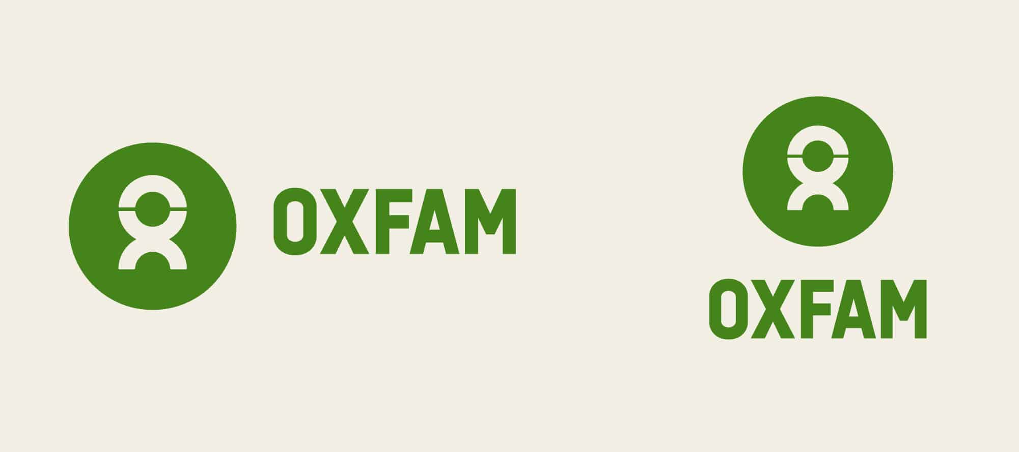
Another distinguishing feature of Oxfam’s logo is its versatility. The organization has approved several versions of the combination mark, including horizontal and vertical orientations and mockups featuring the names of regional offices or different local branches. A black-and-white variation alongside the primary logo in the organization’s signature green is also available. This versatility allows for seamless logo integration into various print or digital marketing materials while ensuring consistency in the unique symbol across all contexts.
3. Teach for Canada–Gakinaamaage
Teach for Canada–Gakinaamaage is a nonprofit that recruits, trains, and supports teachers working in First Nations communities to make education more equitable across northern Canada. The organization’s branding strategy is heavily influenced by its diverse audience, including First Nation communities, educators, and donors, which is especially evident when you examine its logo.
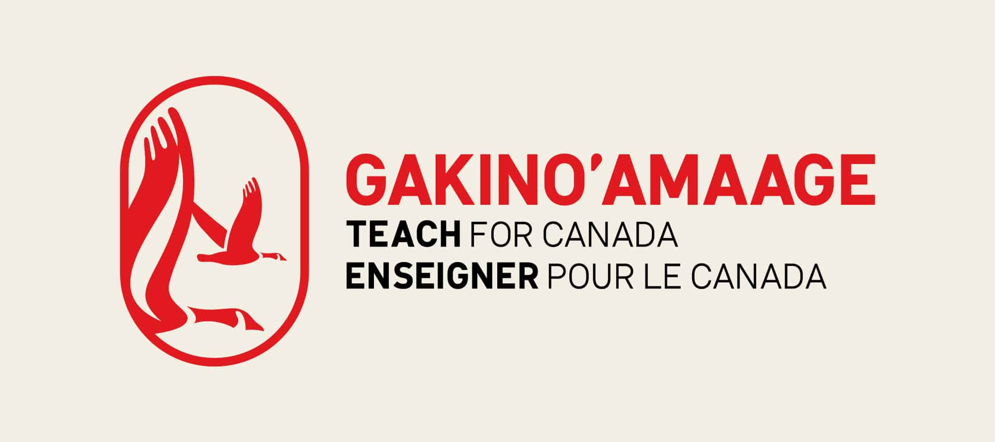
When Teach for Canada–Gakino’amaage embarked on its branding journey, the organization’s focus on language was important. They prioritized Ojibwe in the logo to center the communities they serve while also offering variations that resonate with Canada’s other official languages: English and French.
The design of the logo incorporates shapes inspired by First Nations art, which were decided on with input from Indigenous artists and educators. The graphic of one goose leading another represents the organization’s emphasis on mentorship and the idea of the journey Northward, and the swoop in the wing reflects the concept of the flame of knowledge they strive to spread. In addition, the red colour is associated with the passion and boldness of the teachers and community leaders working to improve the nation’s education system.
4. Curiko
Curiko is a community-centred nonprofit platform that seeks to foster connections between individuals and help them create meaningful experiences together. The organization primarily serves neurodiverse people across Canada, making accessibility and diversity a central element of its identity.
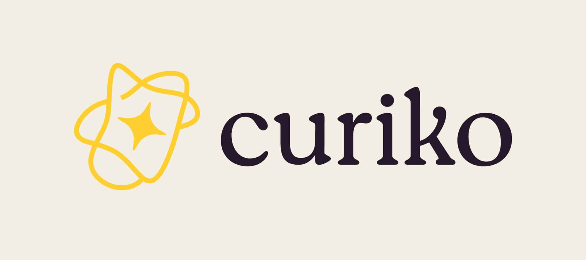
In shaping Curiko’s branding to mirror its identity, the team opted to center its visual imagery around galaxies. The logo features the custom galaxy shape distinctive golden yellow colour, as well as a star to symbolize the creation of experiences and unique moments. While the galaxy shape may occasionally stand alone, it is frequently accompanied by the nonprofit’s name in a legible font with rounded edges, which reflects Curiko’s welcoming and vibrant personality.
5. Community Forests International
Community Forests International endeavours to mobilize local communities to conserve forests and advocate for environmental justice in both Canada and Zanzibar. Given its dual focus, the organization’s brand identity encapsulates elements from both regions to resonate with a diverse audience across both nations.
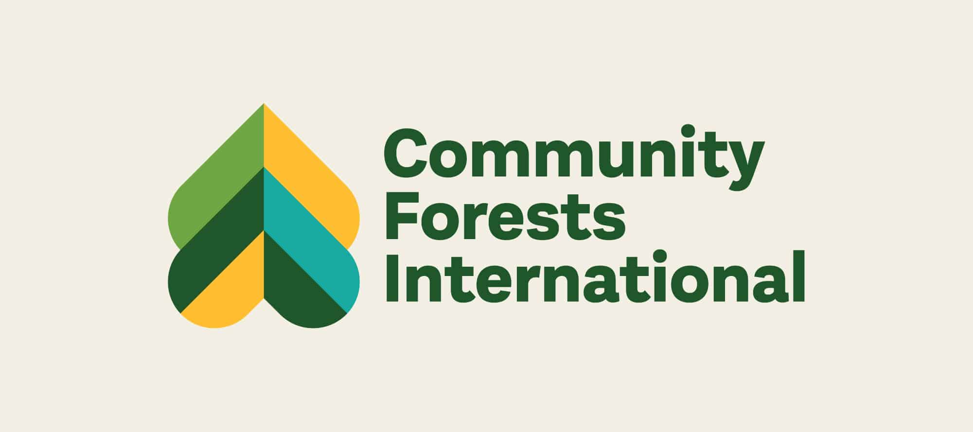
Community Forests International’s logo is shaped like two upside-down hearts that come together to form a tree, encompassing the organization’s passion for its mission and its guiding value of leading with love. The yellow, green, and blue colour scheme speaks to the organization’s role in the environmental space, in addition to reflecting the ideas of light and hope.
6. International Institute for Sustainable Development
The International Institute for Sustainable Development (IISD) is a global think tank that works to drive solutions for economic equity and environmental sustainability. This bold commitment and the impactful work the organization does to fulfill it—from fostering research-driven conversations to backing fundamental policy changes—is reflected in its branding.
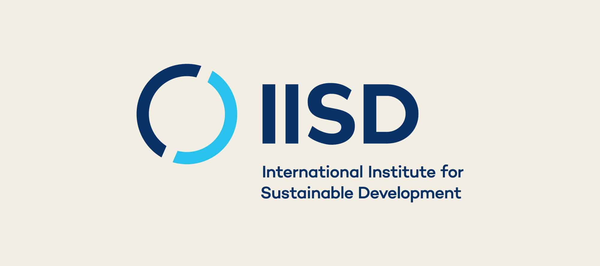
The IISD logo is minimal and direct, showing the organization’s initials (and sometimes its name underneath) in a bold typeface next to a split circle that represents a rotating globe. The division of the globe is set at an angle of 23.5 degrees—the same as Earth’s tilt, which reflects the organization’s focus on global . The dark blue colour that dominates the logo both conveys IISD’s serious personality and creates a sense of trustworthiness for its audience.
7. Catherine Donnelly Foundation
One of Canada’s most established foundations, the Catherine Donnelly Foundation provides flexible grants to support social and environmental justice work for changemakers across Canada. The organization’s commitment to funding bold systemic change is backed by a care-driven approach and a desire to spread kindness in the world—ideas that figure prominently in its branding.
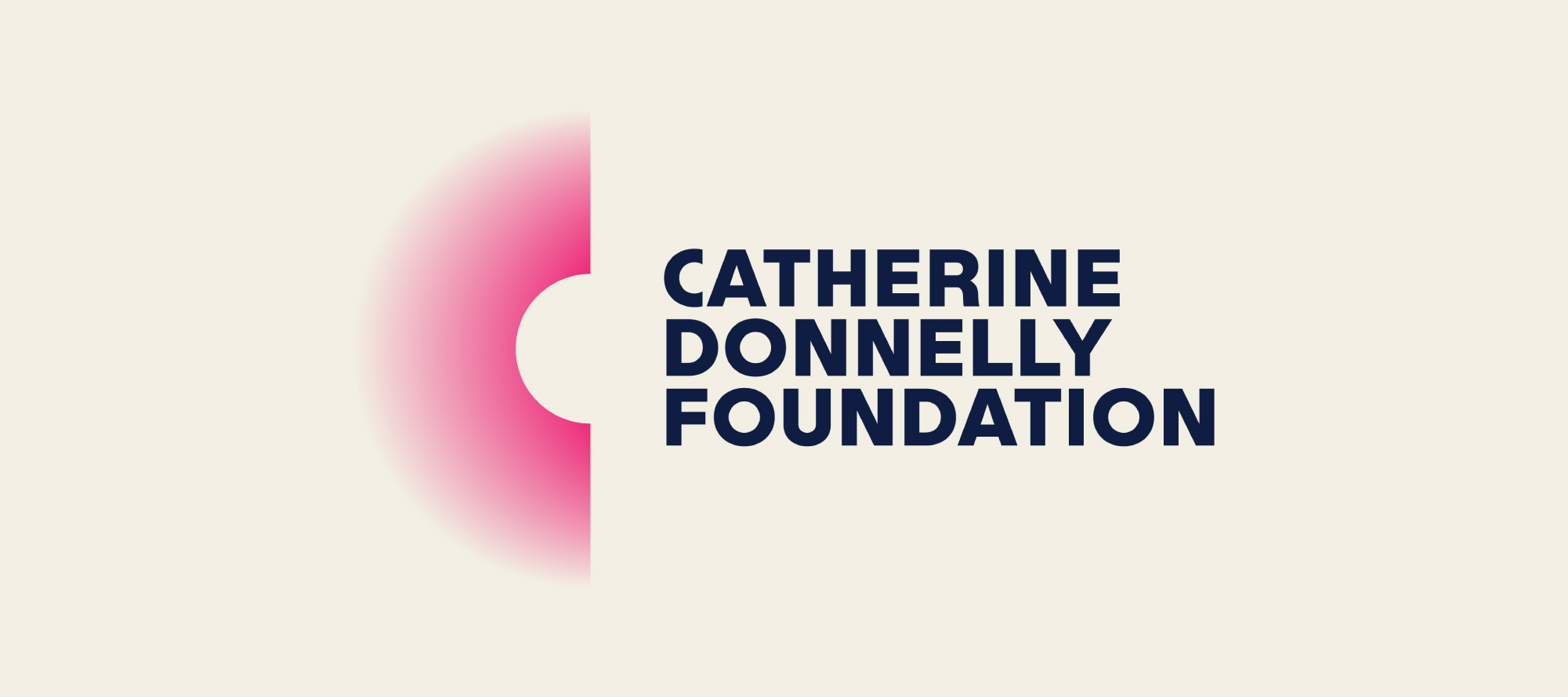
The Catherine Donnelly Foundation logo is shaped like a letter C that appears to radiate light, which represents the illuminating of changemakers and their vital role in effecting positive change.. The C’s pink colour evokes the innovation the foundation wants to fund, and it’s paired with a dark blue that is associated with trustworthiness.
8. Tapestry Community Capital
Tapestry Community Capital is a social financing organization that provides investment through community bonds for nonprofits and cooperatives, helping these organizations finance capital projects in the arts, education, and social housing. The goal of its branding strategy is to position the organization as a leader in social finance while demonstrating its ability to bring communities together (hence the name “Tapestry,” which evokes the imagery of being woven together).
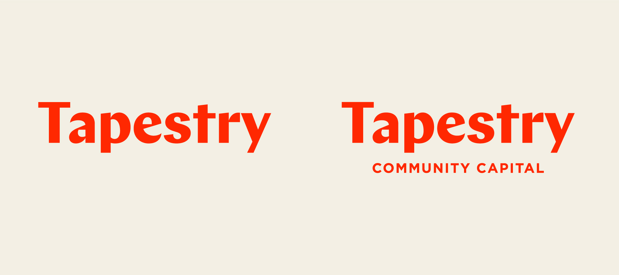
Although Tapestry Community Capital uses a simple wordmark for its logo, the unique typeface and bold orange colour help differentiate the organization from traditional lenders, who may be less open to financing community projects. In some cases, the logo includes the organization’s full name and only the word “Tapestry” in others to emphasize that the community coming together is the most essential aspect of the organization’s model.
Nonprofit Logo Design Best Practices
Once you’re ready to start designing your nonprofit logo, here are a few best practices to keep in mind.
Include your logo in all of your organization’s communications.
Because the two biggest purposes of your nonprofit’s logo are recognition and building trust, supporters should see it in all of the messages they receive from your organization. Make sure to feature it across every communication channel you leverage, including:
- Your nonprofit’s website. Add your logo to your navigation bar so it’s visible everywhere on the site, and link it to your homepage.
- Social media. Besides including your logo in graphics where appropriate, set it as your profile picture to ensure it shows up alongside every post.
- Email. Create a letterhead for mass mailings that includes your logo, and have your external-facing staff members incorporate it into their email signatures as confirmation that the response is legitimate.
- Presentations. If someone from your organization is presenting to a group of external stakeholders (such as at a conference or in a meeting with a potential major donor). including the logo in their slide template will strengthen their representation of your nonprofit.
- Your annual report. Similarly, your logo should be front and centre in the externally-facing summary of your organization’s yearly activities and plan for the future.
Ensure your logo aligns with the layout of each of these communications by creating a few design variations. For instance, a black-and-white version of your logo is helpful for multi-page print communications such as presentation handouts. Additionally, a symbol-only variant might work better for smaller spaces such as your social media profile picture.
Consider your logo as one part of your nonprofit’s brand identity.
It’s common to associate your nonprofit’s logo with its brand. While your logo is indeed a cornerstone of your branding strategy, it’s essential to recognize that it’s just one piece of a larger puzzle. Your organization’s brand encompasses various elements that collectively shape how it is perceived, which include:
- Colour scheme. Colours are naturally associated with certain ideas and feelings, so choose distinct brand colours that will give your audience a sense of who you are and what you do. For example, green is a favourite brand colour among environmental nonprofits because it represents growth and nature. However, among healthcare organizations, red is more popular due to its associations with passion and urgency.
- Typography. This includes the fonts you use in your communications and the weight and hierarchy of typefaces. Your typography should balance readability with expressing your nonprofit’s personality—for instance, bold fonts indicate seriousness, while curved fonts appear more playful.
- Messaging. Although the term “branding” is most often associated with visuals, it also encompasses the way your organization communicates verbally. Your positioning, key messages, tone, and organizational narrative are critical to expressing your nonprofit’s brand identity.
To ensure all of these brand elements, including your logo, remain consistent across various channels, compile them in a document known as a brand guide. Treat this guide as a living document—it should be easy to update as your brand evolves.
Revisit your nonprofit logo design regularly.
As your organization grows and changes, your brand—including your logo—should evolve with it. Many nonprofits consider rebranding to:
- Engage new audiences in their work
- Keep up with current design trends
- Reflect a shift in their values or personality
- Signal the start of a new era after a leadership transition
If any of these situations apply to your organization, look at your logo design and other branding elements to see whether they still accurately represent your nonprofit. If not, it might be time for a brand refresh that may include a new or updated logo!
Work with a nonprofit branding agency.
Creating a logo that reflects your nonprofit’s identity, resonates with your audience, and aligns with the rest of your branding and communication strategy can be challenging. Fortunately, a creative design agency like Loop: Design for Social Good can help your organization through every step of the logo design and branding process.
Loop partners with social impact organizations to design websites, create annual reports, and develop branding strategies that represent their missions and identities. Our process involves:
- Discovery activities to learn about your organization’s values and audience.
- Brand concept development to find an approach that communicates your mission and resonates with your community.
- Brand guide and digital asset creation so you can apply your brand consistently across communication channels.
- Plans for rolling out your branding and ongoing support in applying and updating it.
Throughout this process, Loop works alongside your organization as a trusted partner. Although we have the branding expertise, you’re the expert in your nonprofit, and we want to collaborate with you to find the best solution.
Wrapping Up: Additional Resources on Nonprofit Logos
By following the tips and strategies above, you’ll be well on your way to designing an attention-grabbing, meaningful nonprofit logo. Look to other organizations for inspiration, and don’t hesitate to reach out for professional branding help whenever you may need it!
For more information on nonprofit logos and their applications, check out these resources:
- Nonprofit Branding: Our Complete Guide and Best Examples. Dive deeper into the different aspects of nonprofit branding and get inspired by even more examples from organizations like yours.
- 14 Nonprofit Website Best Practices to Maximize Engagement. In addition to maintaining consistent branding and logo usage, explore a variety of ways to take your nonprofit’s website to the next level.
- Nonprofit Branding Services by Loop: Design for Social Good. Learn more about Loop’s nonprofit branding process and what you can expect from working with us.
