14 Nonprofit Website Best Practices to Maximize Engagement

Your website is the backbone of your nonprofit’s communication strategy. When you send emails, you direct readers back to your website. Similarly, your social media pages likely have links back to your website in your profile. It’s where visitors come to learn about your mission, sign up to volunteer, and donate to your cause.
In summary, your website captures your audience’s attention and encourages engagement.
Use industry best practices to increase your visitors’ engagement, growing their involvement with your organization. In this guide, we’ll cover nonprofit website best practices for the following categories:
A well-designed website is not only informative, but it provides opportunities for your audience to directly engage with your mission. Let’s get started.
Nonprofit Website Best Practices for Design
Design elements create the overall look and feel of your nonprofit’s website. They encompass both visual elements and the copy informing visitors about your nonprofit. Design shapes how you present your content, conveying your mission and your brand to your audience.
1. Maintain consistent branding.
When designing your website, be sure to maintain consistent branding across the entire site. Create a digital style guide to ensure you use the same brand elements consistently between pages. Your style guide will be a web-specific set of guidelines that covers the online elements you’ll use to communicate your brand.
Include the following elements of your digital brand in your style guide:
- Colour palette. Colours are naturally associated with specific feelings and ideas. Use these associations to determine your brand’s colour palette. For example, green usually represents growth and prosperity, as well as environmental causes. Meanwhile, red is a bold colour that makes people think of passion and strength, and is often associated with health-related causes.
- Typography. Typography consists of the font you choose, your use of capitalization, and hierarchy of text headings. When it comes to typography, one of the greatest decisions you’ll need to make is your choice in fonts and how you organize the different levels of headings. Choose a font that is legible at large and small screen sizes, and one that represents your personality while ensuring it’s readable for your audience.
- Positioning. Your positioning is essentially what makes your nonprofit unique. What differentiates you from other organizations with similar missions? Use your organization’s positioning to emphasize your nonprofit’s unique qualities and encourage loyalty in your audience. After all, they can only get your unique qualities from you.
- Tone. The tone you use when speaking and writing is an expression of your personality. If you’re on a website that uses a formal tone on the home page (no contractions, direct language, etc.) but an informal tone on the about page (contractions, storytelling strategies, and colloquial language), it might be confusing. Determine what language choices define your nonprofit’s tone and stick with them.
- Logo. Your brand is more than your logo, but your logo is an important element. It should appear in the same location across all of your web pages (usually in the top middle or left hand corner). Add a link back to the homepage when people click on your logo. Include your logo on all external communication documents, including your social media platforms, fundraising pages, emails, and other online resources for consistency and continued recognition.
Create your digital style guide before designing your website. Then consult it as you design each page, including your homepage, about page, and donation forms. Use your style guide when creating other online marketing materials in addition to your website, such as email, direct mail, social media posts, and more.

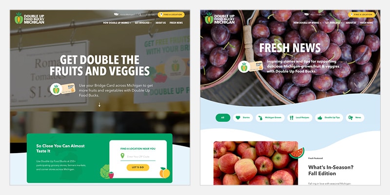
As you can see on the above pages from Double Up Food Bucks’ website, there are a number of consistent elements. The text’s style, weight, and font all stay the same. Plus, the logo is consistently featured in the upper left-hand corner of the page. Even the images below the feature banner on each page both have rounded corners and fruit graphic overlays.
2. Write engaging website copy.
The second important nonprofit website best practice to remember is writing engaging website copy. First, consider your audience and the type of messaging they will respond to best. If your nonprofit works with children, you’ll use different language elements than organizations that work primarily with government agencies.
Your mission statement and other educational information regarding your cause should be clear, comprehensive, and use mostly simple sentences to make it easy for everyone to understand. A clear mission helps your visitors understand what you support and why you want your audience to also provide their support.
Charities can also capture their audience’s attention by leveraging storytelling strategies. Stories pull at the heartstrings of your audience. Use your blog, email, and educational resources to explain the impact you’ve had in your community. In these stories, center the people in your community that you work with, and demonstrate how your nonprofit provides resources that impact their lives.
The best way to get a feel for what makes copy engaging is exploring the best nonprofit websites and studying their communication strategies. Pay close attention to the stories they tell, the way they introduce calls-to-action, and how they discuss their mission. Get inspired by the best to make sure your site is among these great examples in the future.
3. Feature key mission information.
We covered how your mission statement and educational information should be clear and straightforward. It should also be easy to locate on your website. Feature this key information on the main pages of your website, such as the home page and about page, so it’s in a predictable location for your new visitors.
Imagine you visit a nonprofit website for the first time and can’t find the mission within the first minute. You’d likely give up and offer your support elsewhere.
Your mission should set the tone for the rest of your website, helping to craft your overarching mission. From taglines to stories, everything should relate back to your mission and convince your audience to share your passion for it. This creates a holistic approach for your visuals and messaging, which is one of the most important trends in the nonprofit website design space.
4. Leverage clear space.
For inexperienced designers, it can be tempting to fill every inch of usable space on a website with images or text. However, clear space is actually more valuable than excessive content, especially for the web.
Leverage clear space between design elements to draw your audience’s eye to specific page elements.
This nonprofit website best practice is important to maintain your supporters’ focus. Consider the following images. In the left-hand image, it’s difficult to know what to look at because there are too many elements filling up the page. Meanwhile, the right-hand image looks much cleaner and directs your attention to the page’s main element.
Nonprofit Website Best Practices for Usability
Usability refers to the website elements that make it easy for your visitors to discover your mission, learn more about your cause, and take action to show their support. Implementing these nonprofit website best practices ensures that your site is usable for everyone and on any device.
5. Ensure intuitive navigation.
Intuitive navigation makes it faster and easier for your visitors to find the information they’re looking for after arriving on the site.
Use your main navigation bar to guide visitors to your website’s core pages, such as the home page, about page, blog, and current initiatives. Then, use buttons and other calls-to-action to capture your audience’s attention and encourage them to visit your donation page, volunteer registration page, newsletter signup form, and other engagement opportunities.
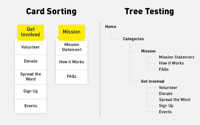
Before you start designing, work with volunteers to see how they naturally group and categorize information on your nonprofit’s website. You can leverage the following tests to get started:
- Card sorting. Choose around 40 to 80 topics that cover the main information that will be included on your website and write them down on index cards. Then, ask your volunteer to organize these cards into groups and provide a name for each group to categorize it. Conduct this test with 15 to 20 volunteers to understand how the majority of them would group information. This is an effective indication for how you should organize your website’s menus and what labels you should use.
- Tree tests. Tree testing is an effective tool to test out your navigation before designing your site menu. Start by categorizing information and laying it out as a hierarchy in a spreadsheet. Then, use a tree testing tool to develop a clickable menu with categories and subcategories on which your volunteers can click. Then, provide volunteers with tasks that ask them to find specific information. They’ll then navigate through your trees to find it, documenting how intuitive the organizational hierarchy was. Ask for feedback during and after the test.

Once your site is complete, conduct a final usability test with volunteers. Ask them to find certain information on your website and complete various tasks. Then, ask for feedback. This will help you clear up any lingering confusion regarding your website navigation.
6. Optimize for mobile.
People accessing your site via mobile phone should have just as positive an experience as those who access it via desktop. Since 2015, the amount of mobile web traffic has increased from 31% to 54% worldwide.
Due to the increased use of handheld devices, your nonprofit’s website needs to be mobile responsive. Mobile responsiveness is when images and text resize automatically to fit the screen the page is viewed on.
When you make changes to your website, always check to see how those changes impact both the mobile and desktop views. No one wants to scroll from left to right to view an image or read text. Similarly, when embedding forms on your page, ensure these are also mobile-responsive so that your audience can donate, register, and sign up for various opportunities from their phones.
7. Minimize load times.
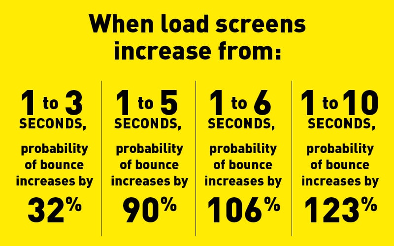
Web pages that take too long to load see high visitor abandonment. Studies have shown that mere seconds of loading time significantly increase bounce rates. For instance, on mobile, when load times increase:
- From 1 to 3 seconds, the probability of visitors bouncing increases by 32%.
- From 1 to 5 seconds, the probability of visitors bouncing increases by 90%.
- From 1 to 6 seconds, the probability of visitors bouncing increases by 106%.
- From 1 to 10 seconds, the probability of visitors bouncing increases by 123%.

Minimizing your page loading times is a nonprofit website best practice that helps keep visitors on each page long enough for them to read its contents and decide to support your cause.
To minimize your page loading times, your nonprofit can take the following steps:
- Resize images to fit the dimensions you need and compress them to reduce their file size, making them load faster.
- Remove render-blocking JavaScript from your website.
- Use browser caching so that visitors who return to your site won’t need to wait for it to load from scratch again.
Use resources like Google PageSpeed Insights to check the speed of pages on your website and view recommendations to speed up your load time. Plus, be sure to perform regular maintenance to remove unnecessary and duplicate files that might be slowing you down.
8. Write clear calls to action.
Your calls-to-action are the buttons and links that lead site visitors to your engagement opportunities. Make sure they stand out on each page and have clear labels so that supporters know what to expect when they click through.
Calls-to-action often take the form of buttons. These buttons should pop in colour to stand out with adequate contrast on your pages. On your home page, include a button for the most important action a visitor can take to engage with the cause. For example, you may write “Give Today!” on a button that leads to the donation form.
Call-to-action buttons can also be used to complete an action, such as clearly labeling the “Submit Response” action at the bottom of a form.
9. Offer multiple engagement opportunities.
Different visitors will be intrigued and interested in different opportunities to get involved with your mission. While some may prefer donating their funds, others may prefer a more hands-on activity like volunteering.
Determine what activities are the most important for your mission and feature them as a call-to-action on your homepage. But include other opportunities for your site visitors to get involved in your mission, giving them a choice in how they support your mission.
Here are some ways you can encourage engagement from your website visitors:
- Donation pages
- Volunteer registration forms
- Advocacy campaign participation
- Newsletter sign-ups
- Event registration
- Social media sharing or following
Use multiple communication channels to get your audience involved in multiple opportunities. For example, launch an email series for supporters who sign up for your newsletter, encouraging them to return to your website to give.
10. Ensure website accessibility.
Inaccessible websites alienate some individuals, preventing them from accessing and participating in site opportunities. To engage as many audience members as possible, incorporate accessibility standards as one of your nonprofit website best practices.
Here are a few accessibility elements to include on your website:
- Alternative text for images. Write descriptions of the images on your website and include them as alternative text. This allows individuals using screen readers to never miss out on the value your images add to a page.
- Substantial colour contrast ratios. WCAG 2.0 guidelines require images and text to have a colour contrast ratio of at least 4:5:1. This allows colourblind individuals to differentiate between each element on screen.
- Closed captions for videos. Closed captions include more information than standard subtitles, including who is speaking in a video, descriptions of background noise, and more. This makes them more valuable for those hard of hearing to access video content.
- Sequential HTML heading tags. The HTML of various pages should be intuitive and hierarchical in nature. This means using H1 tags for titles, H2 titles for subheadings, and so on in sequentially descending order.
Not only is web accessibility becoming more prevalent in legal cases, but it’s also essential to capture all prospective audience members’ attention. Don’t alienate the members of your audience who may have disabilities. Use official accessibility checklists and resources like web development agencies to ensure your site is usable by all prospective and current visitors.
Nonprofit Website Best Practices for Performance
Your nonprofit’s site visitors will be the ones actively getting involved with your mission. Therefore, they’re the primary group that your website needs to engage. However, they’re not the only ones viewing your site. Take into account how search engines like Google will read your site and determine its search results rankings so that it will be seen by more people, expanding your audience further.
The following nonprofit website best practices will help your organization create a site that is appealing to search engines, so that it will perform well on results pages.
11. Refresh content often.
As time goes on, content on your website gets stale (not to mention outdated). Refresh your content frequently, showing search engines that everything is up-to-date.
Also, consider what will best match the search intent for your site visitors. If someone is searching for “animal shelters near me,” they’re probably looking for opportunities to get involved either by donating, volunteering, or adopting a new pet. Google recognizes what the intent for searchers is and fills the results page with content that fulfills that intent.
As a part of the ongoing website creative process, check regularly on existing content, conduct updates as necessary, and consider various pages’ search intent.
12. Conduct keyword research.
Organic and paid searches both require you to conduct keyword research to determine which results pages you want to target as a part of your search engine optimization strategy. Choose keywords related specifically to your cause and have a high search volume. For example, an animal shelter may choose keywords like “no kill animal shelters” or “pet adoption near me.”
Write content specifically targeted for these keywords, meeting the searcher intent. If you want to invest in paid searches, Google will help! Google provides grants for certified nonprofit to receive paid ad searches. These Google ad grants provide up to $10,000 in ad credits per month for nonprofit organizations like yours.
13. Implement security features.
Not only does Google value websites with safety features, but proper security is also essential for maintaining your audience’s trust. Visitors put their personal information on your website, from their names and addresses to their credit card information. Failing to protect this information can lead to an immediate loss of support and a long-term hit to your credibility.
Make sure your nonprofit website is secure by taking steps such as the following:
- Purchase your SSL certificate. SSL stands for “secure sockets layer.” It’s what changes your website domain from starting with an HTTP to HTTPS. When a site has an SSL certificate, it encrypts communications between the web browser and server, providing a safer way for visitors to access your site.
- Look for PCI-compliant donation software. Your donation pages may be integrated with a separate donation software solution. Be sure the donation forms you use to collect contributions online are PCI-compliant to ensure your donors’ safety.
- Update software and plugins as soon as possible. Updates often include bug fixes and security updates, providing safer software solutions. When you fail to update your CMS, plugins, or other software, you’re leaving your information vulnerable. Update your various software solutions as soon as they become available.
One of the worst things that could happen to your nonprofit is a security breach. Breaches break the trust with your supporters, sometimes in an irreparable way. Secure your website and donor data to prevent this from occurring.
14. Integrate your site with other software.
Your website provides opportunities to collect key information about your nonprofit’s audience. That’s why this final nonprofit website best practice featured in this article is to integrate your software solutions when possible.
Integrating the forms and donations software used on your website with your CRM and other marketing solutions allows you to store data about your audience.
You can then use this information to reach back out to your audience and encourage them to get more involved. For example, when your donation page integrates with your CRM, a new donor who gives via your website will automatically have a profile created in your database. This information can then be used to send them a thank you email and encourage them to sign up for your newsletter. This saves you the time and effort of manually updating your database with new supporters.
Wrapping Up
Creating a website for your nonprofit is hard work. Leverage these best practices to make this important marketing resource even more impactful and effective. If you’re overwhelmed by all of the necessary considerations or simply want some help with the design process, partner with a design agency to get started.
Look for a provider with experience working with nonprofits, like Loop: Design for Social Good. Our designers know what nonprofits like yours are looking for in a website and can help create a beautiful, effective website to represent your cause.
Looking for more information to design your nonprofit’s website? Check out these additional resources:
- Best Nonprofit Websites: Our Roundup of Ideas. Get inspired by reviewing the excellent web design elements included in the best nonprofit websites.
- Nonprofit Branding: Our Complete Guide and Best Examples. Developing your brand? Get started with the information in Loop’s comprehensive nonprofit branding guide.
- Work with the Experts at Loop: Design for Social Good. Ready to get started with your website? Reach out to the experts at Loop today!


