Inspiration Roundup 2: New Trends in Design for Social Impact
Spring 2020
By Emma Steele | May 15, 2020
[ssba-buttons]
Welcome to Loop’s second edition of Inspiration Roundup! The Loop team has been working on some amazing projects this spring and we are feeling super inspired. We’ve been gathering lots of visual precedents to get the creative juices flowing and are excited to share some of them with you.
You know we’re all about spreading the love! So, this Inspiration Roundup talks about trends in the ‘design for social good’ space and how other agencies are using them effectively for social enterprise marketing, and branding for nonprofits. #respect
1. Holistic Visuals & Messaging
Holistic graphics & brand messaging can sound like a design no-brainer, but utilizing recurring themes to create a consistent brand experience can be tougher than it looks. A great brand is almost cyclical: the offering informs the name, which informs the messaging, which informs the brand visuals, which re-inform the offering and so on. This way of thinking makes for a really robust brand that can speak to people on all the different levels.
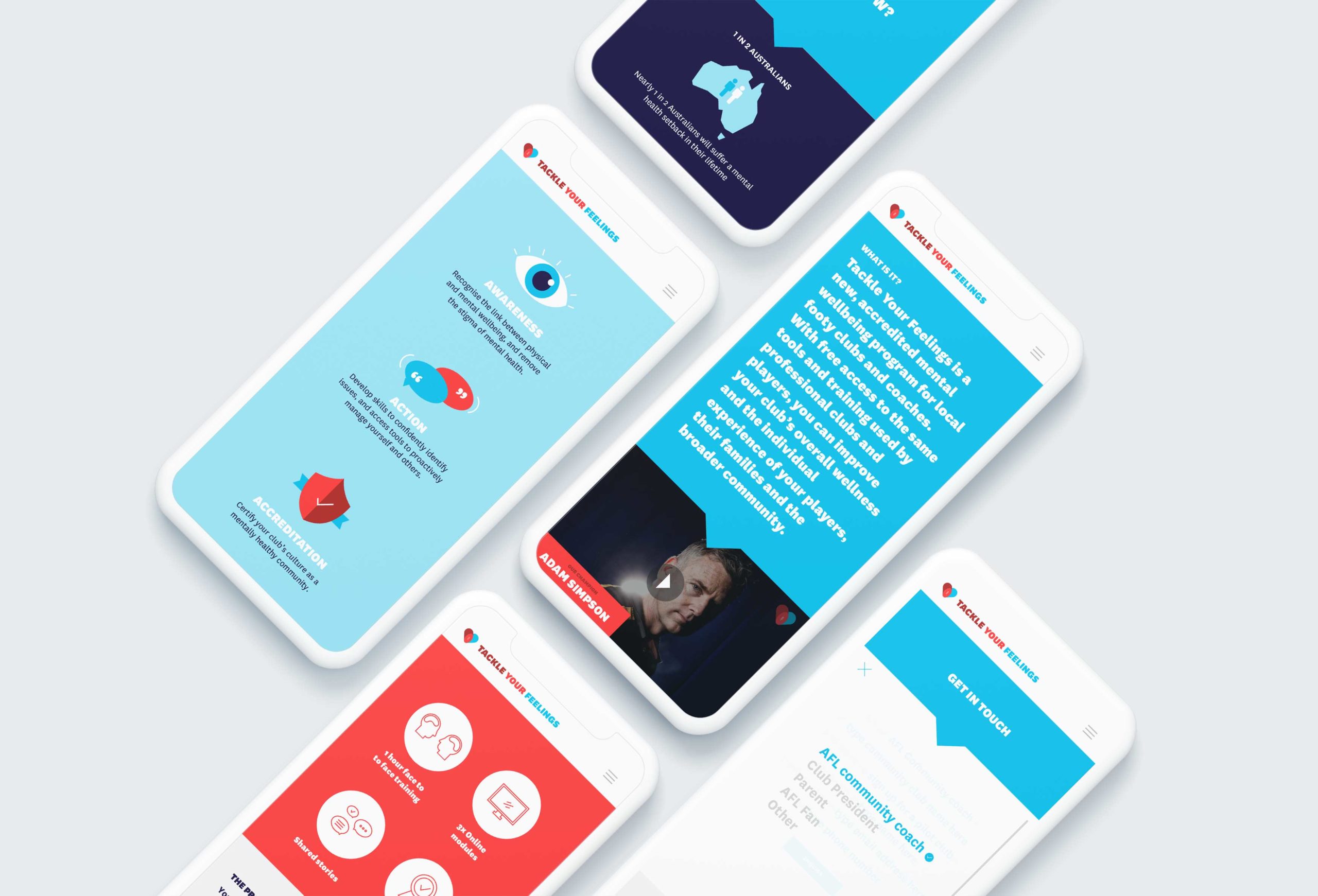
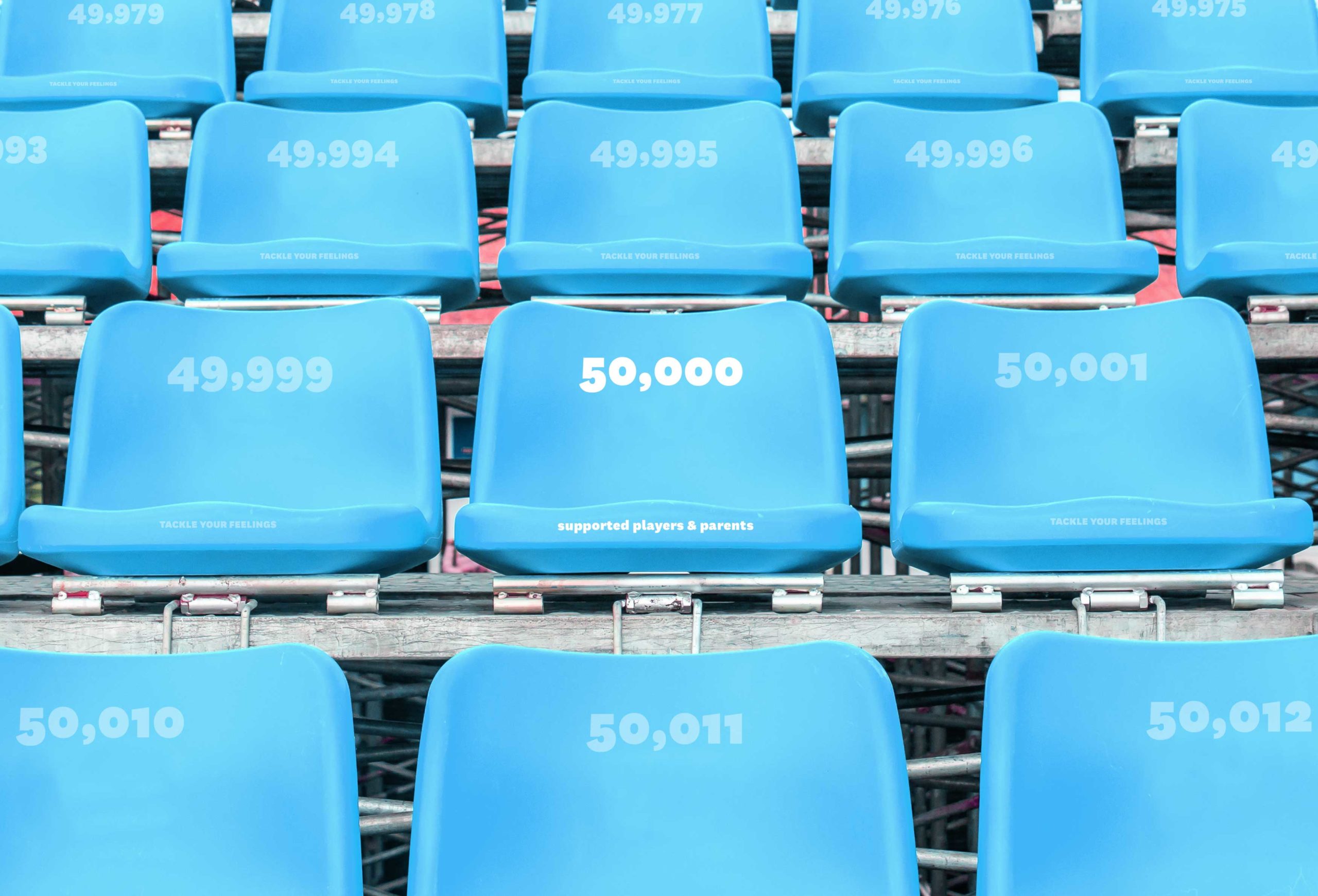
Project that nailed it: Tackle Your Feelings
Agency that’s killing it: Ascender
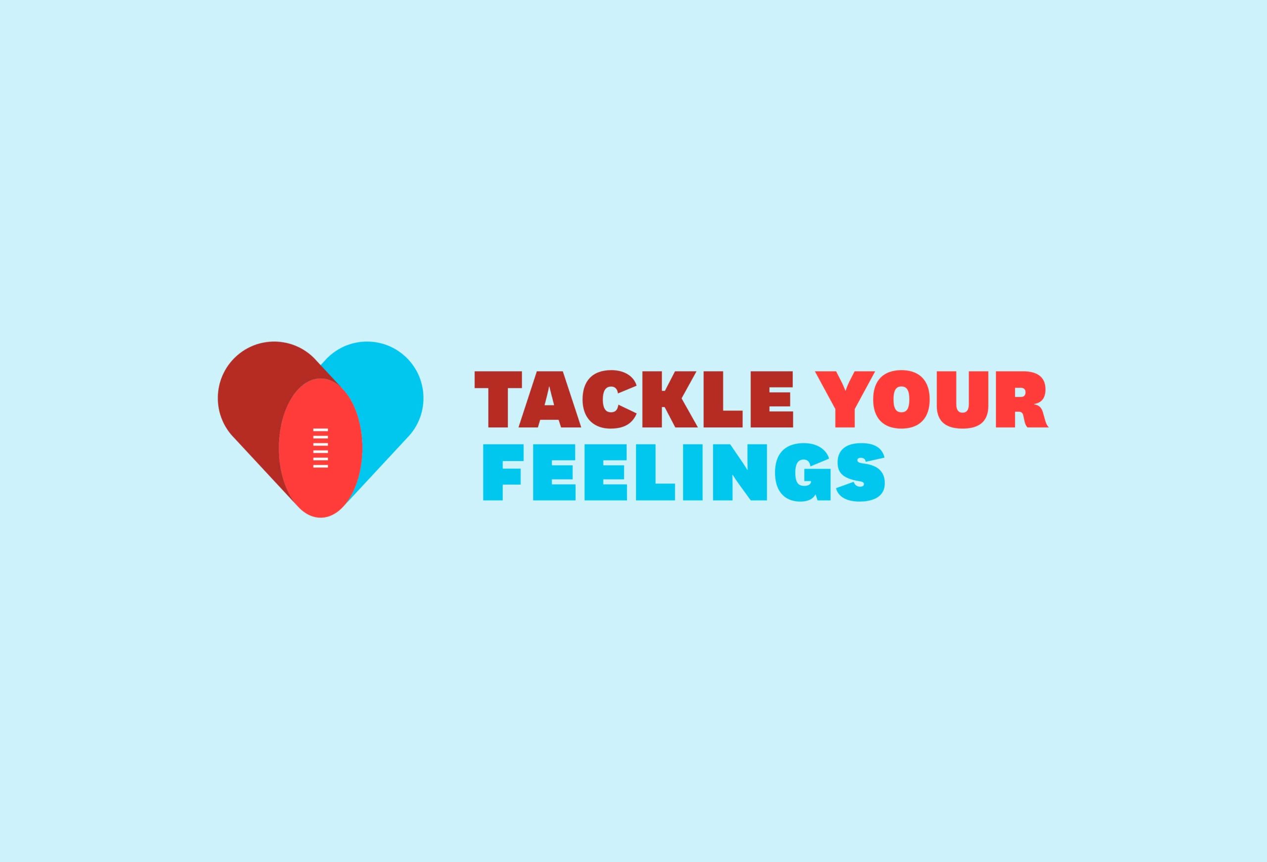
One project that accomplishes a holistic brand in spades is the identity for Tackle Your Feelings. Designed by Australian agency Ascender, Tackle Your Feelings is a new mental health training program for local Australian Football League (AFL) clubs and coaches. The program provides free access to training and tools, inspired by those used by professional AFL clubs and players, to help improve their understanding and awareness of mental health.
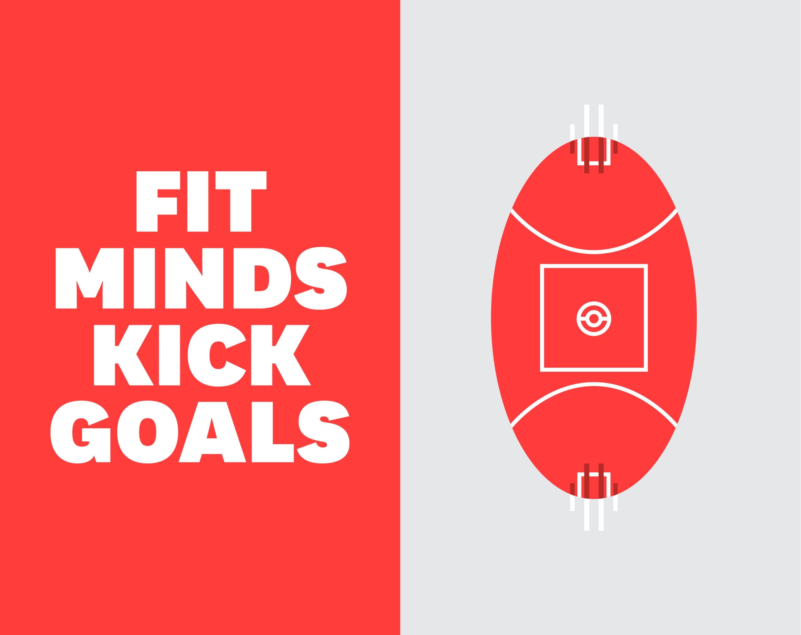
The visuals and messaging are so clearly informed by Australian football – from the repeated oval shape in the identity’s logo & icons to headlines like “Fit minds kick goals” and “Minds need coaching too” – that you are instantly immersed in the program from the moment you hit the website.
The brand colours are also reminiscent of sports – red and blue being the most commonly used colours in sport & jersey design – with a youthful and optimistic twist. Even things like data visualization have been done using sports metaphors and photography (so smart!).
2. Challenging Visual Stereotypes
When you’re a designer who works in lots of different sectors, it can be easy to fall victim to visual tropes and stereotypes. Thinking that a brand for women needs to be soft or delicate in order to appear feminine, is one example. But we are definitely seeing an increase in brands and agencies that are intentionally challenging those stereotypes, and opting for designs that are unexpected and thought-provoking instead!
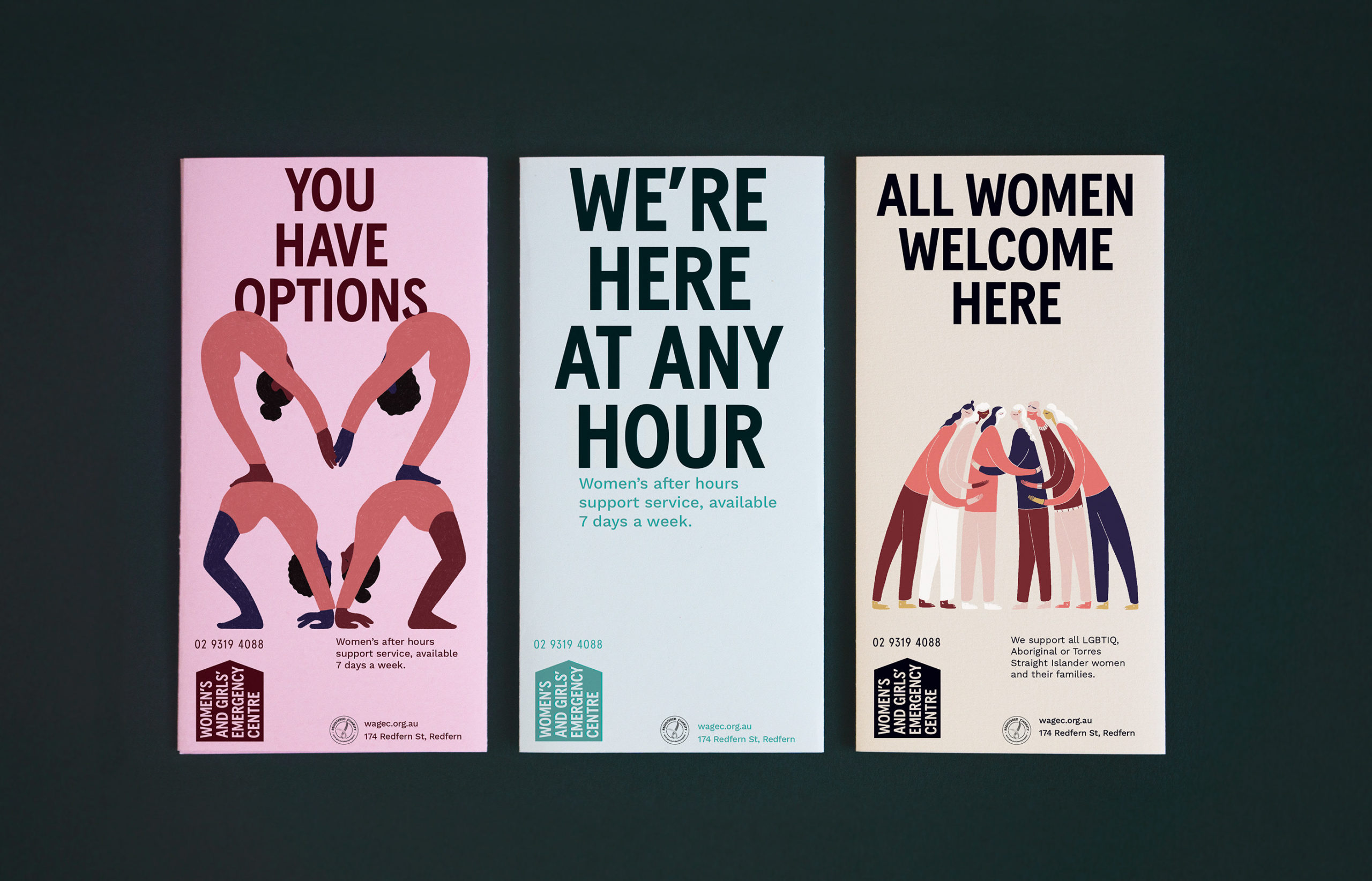
Project that nailed it: Women’s and Girls’ Emergency Centre
Agency that’s killing it: For The People
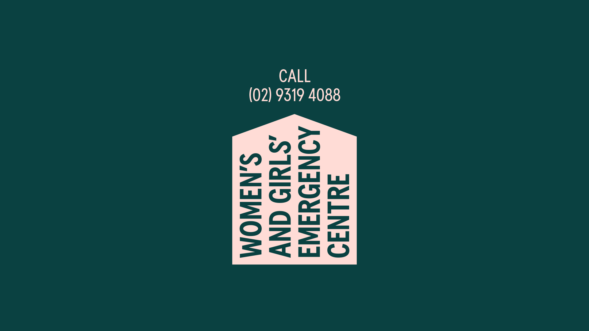
The identity for the Women’s and Girls’ Emergency Centre is definitely one that circumvents “feminine” visual stereotypes in favour of bold, contemporary design. This new identity is a huge departure from the swirly blue & purple brand they were using previously. The typography is tall and strong, and the brand mark is unexpectedly turned on its side which gives a sense of difference and upheaval.
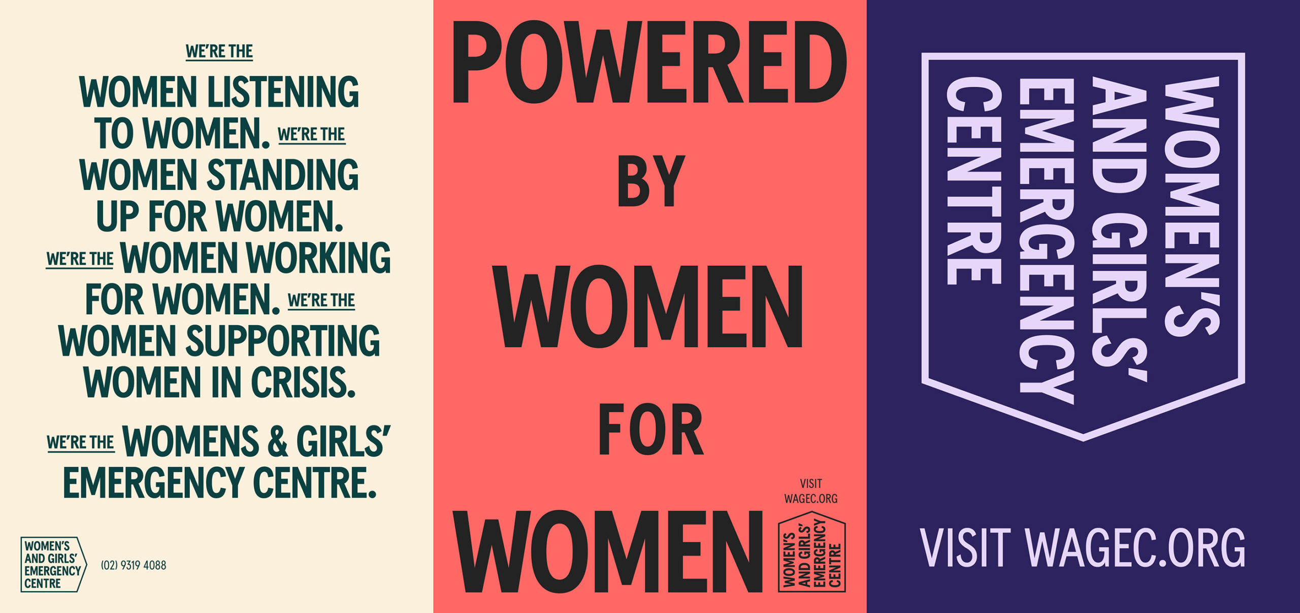
While the brand uses some softer colours, they’re also paired with darker more dramatic tones that give the identity depth and offset the pastels. And although the illustrations include lots of feminine figures, many of them are strong, gritty and dynamic.
The identity definitely speaks to women, but it also has an activist tone that is powerful, and challenges the stereotype of “feminine” brands – they don’t have to be soft and pink and flowery, they can also be energetic and mighty and strong!
3. Speaking Directly To Your Audience
The key to human-centred design is to put your audience or user at the centre of everything you do. And if you aren’t a member of the audience you’re designing for, this can often involve research, thinking and going against some initial design instincts. But when this strategy is executed well, you have the ability to strengthen the connection to your audience exponentially, because they feel like this product, service, or initiative was tailor-made for them.
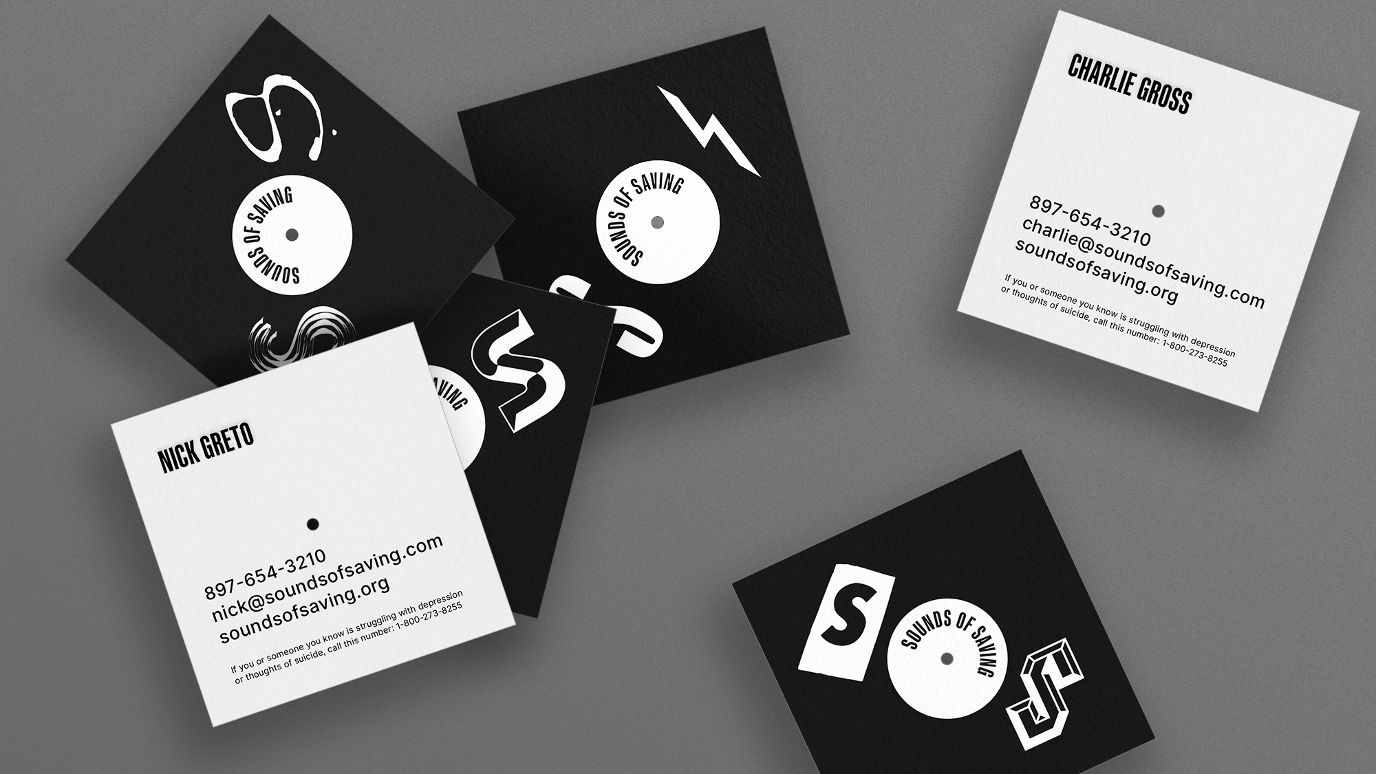
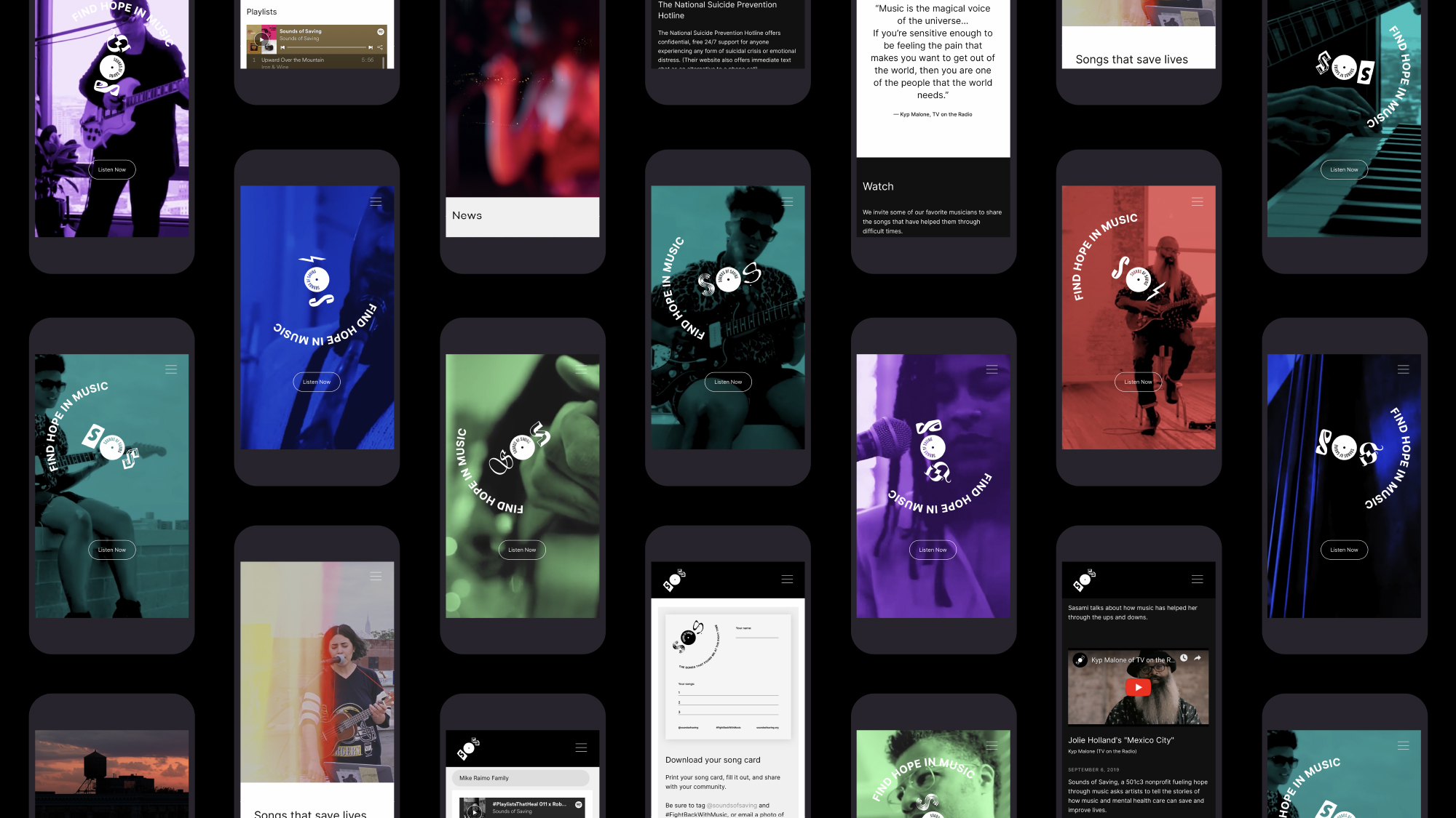
Project that nailed it: Sounds of Saving
Agency that’s killing it: RedPeak
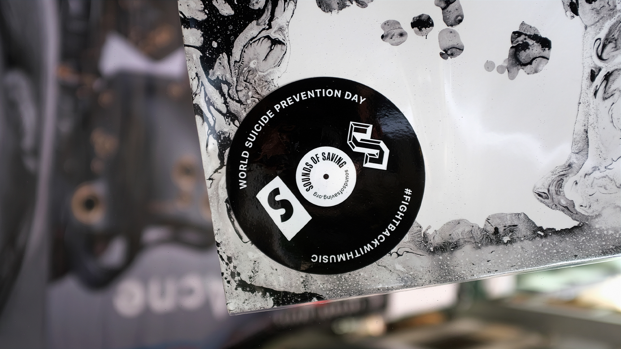
This strategy can be particularly valuable when you’re speaking to young people. They can be an audience that’s forgotten when it comes to branding, especially when companies choose to market over their heads instead of directly to them. However, this is an audience that can have strong opinions and autonomy, especially when it comes to serious issues like mental health & wellness. The Sounds of Saving campaign designed by RedPeak uses a gritty & cool aesthetic to connect with young people about mental illness and suicide prevention through music.
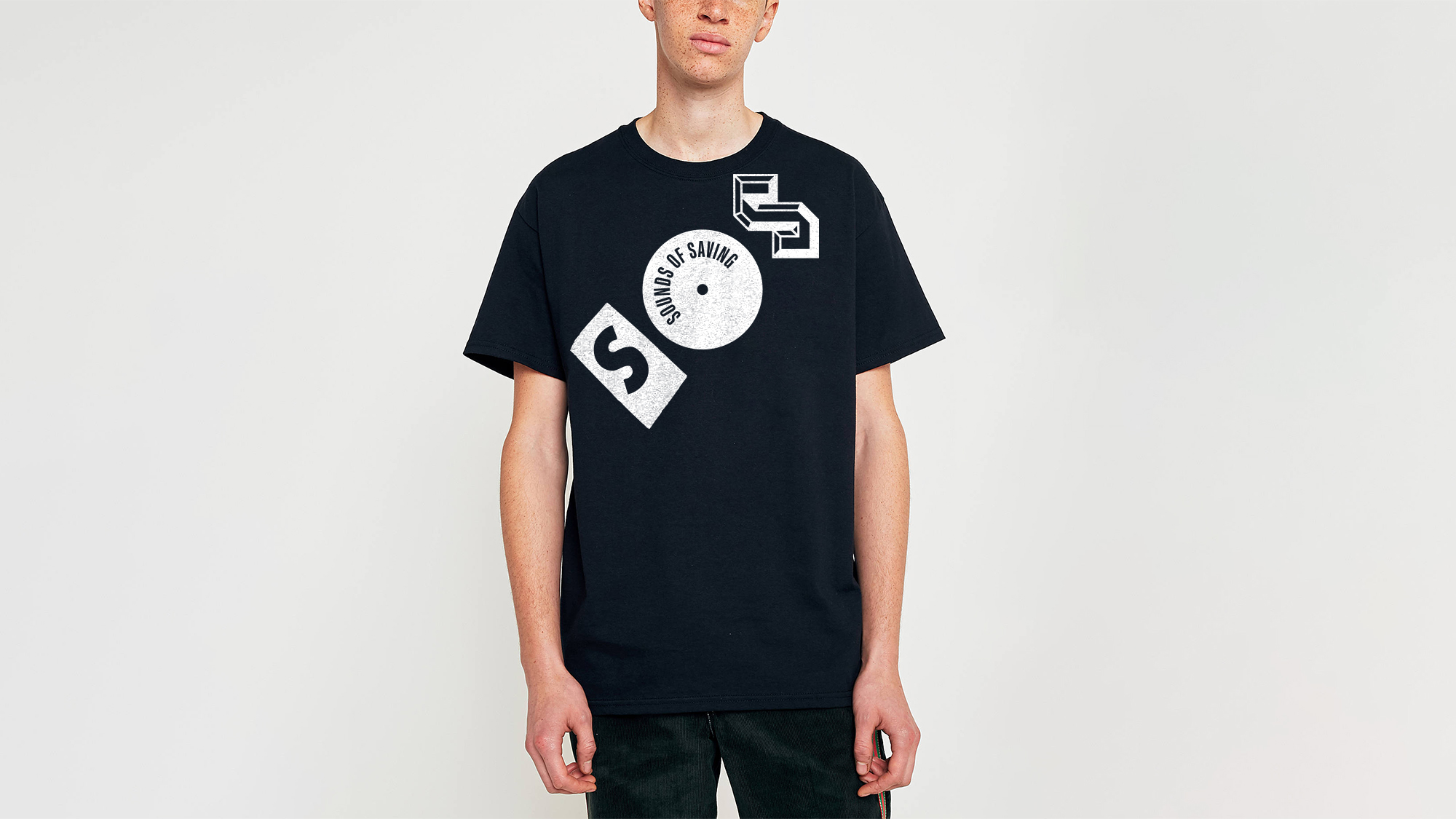
This innovative brand successfully sidesteps traditional “health & wellness” aesthetics and tackles a very sensitive issue head-on. The adaptable brand mark is modelled after a vinyl record using typography that has a punk, rock & roll edge. These elements reflect the organization’s young audience as well as their mission of dealing with the pain of mental illness together, as a community, through music.
The brand does a brilliant job of reminding us that difficult topics don’t always have to be softened or avoided when it comes to branding & messaging. So let’s all strive to speak to our young audiences in an edgy & youthful way!
4. Human > Corporate
Making a brand feel genuine can be a tricky endeavour – it’s a fine line between looking professional & credible and feeling boring & corporate. So even when you’re trying to give a brand credibility, it’s so important to infuse humanity and personality into the messaging.
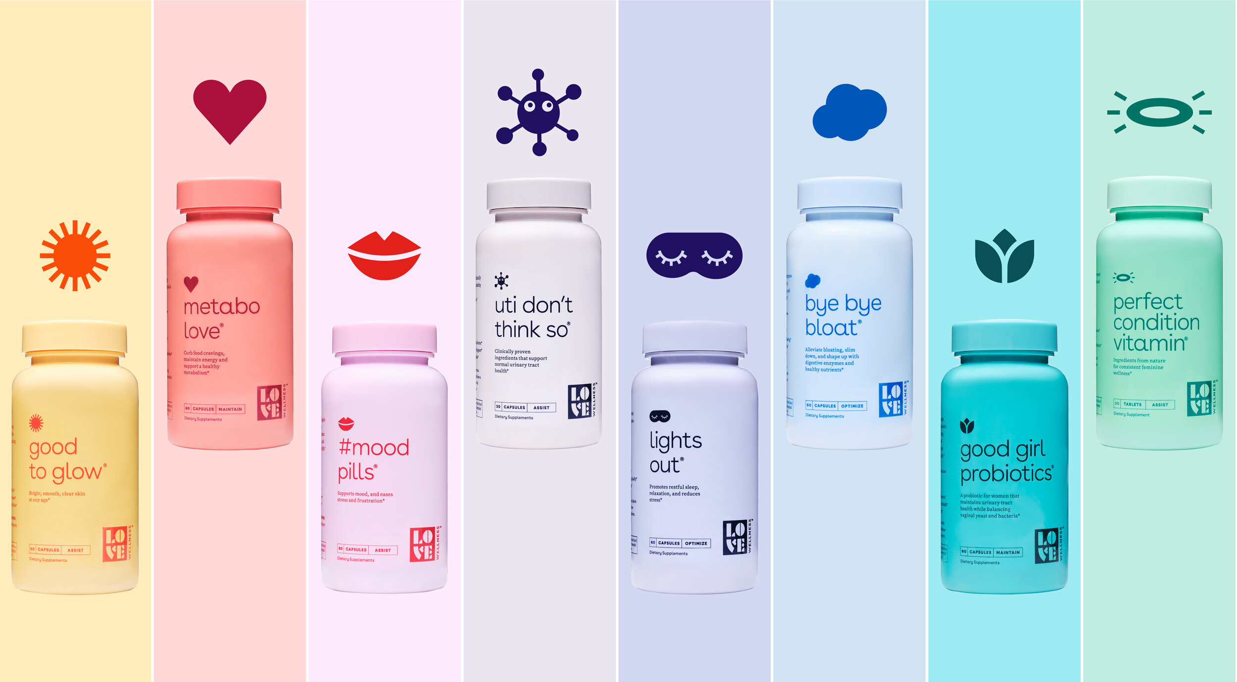
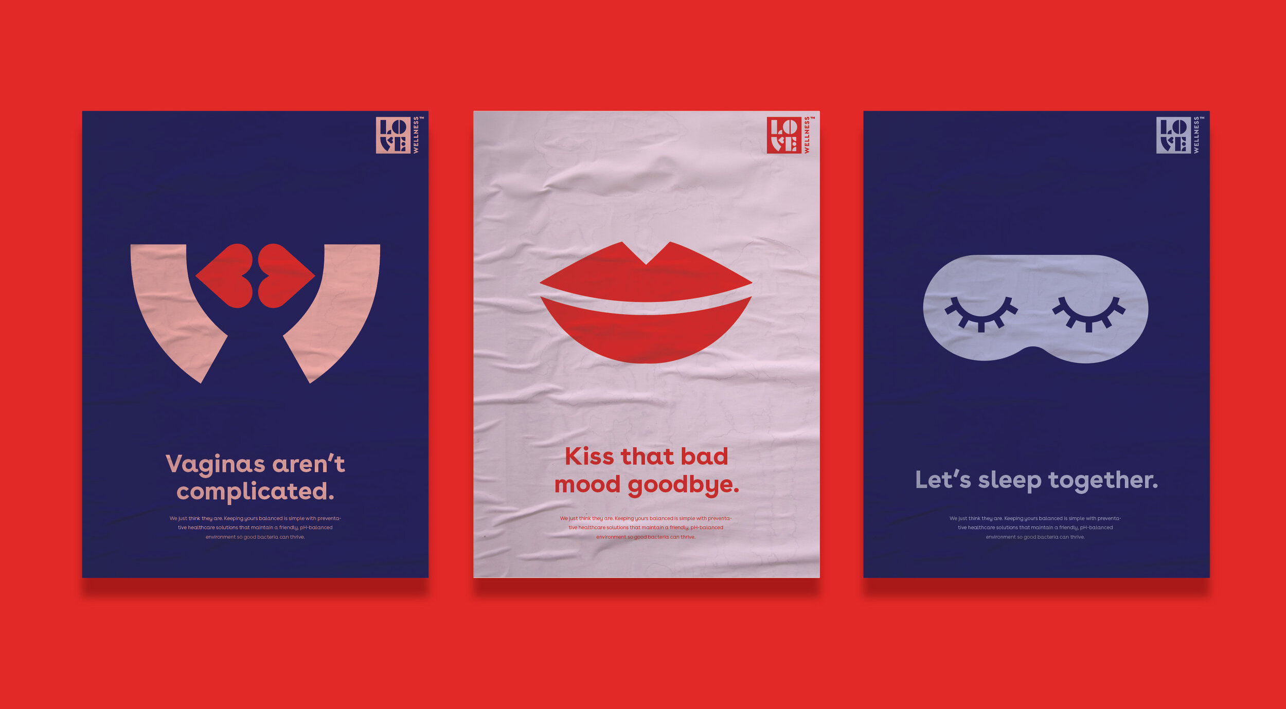
Project that nailed it: Love Wellness
Agency that’s killing it: Lobster Phone
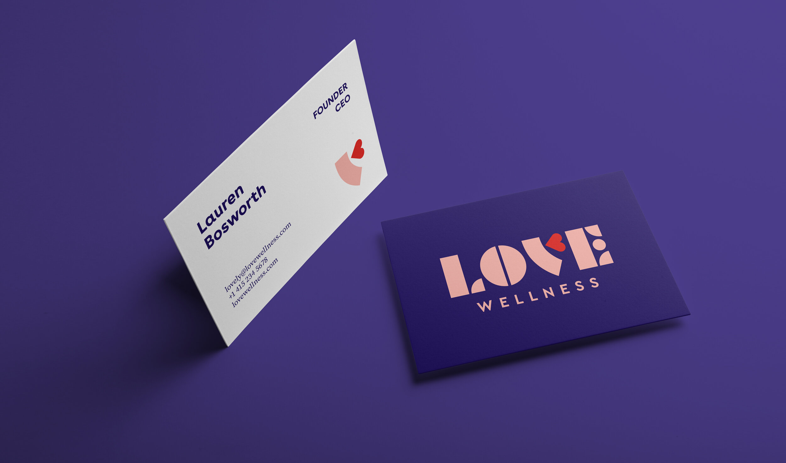
The Love Wellness brand by Lobster Phone is an awesome example of a brand that prioritized personality. The personal care product industry isn’t the most innovative when it comes to graphic design so the Love Wellness brand is a breath of fresh air.
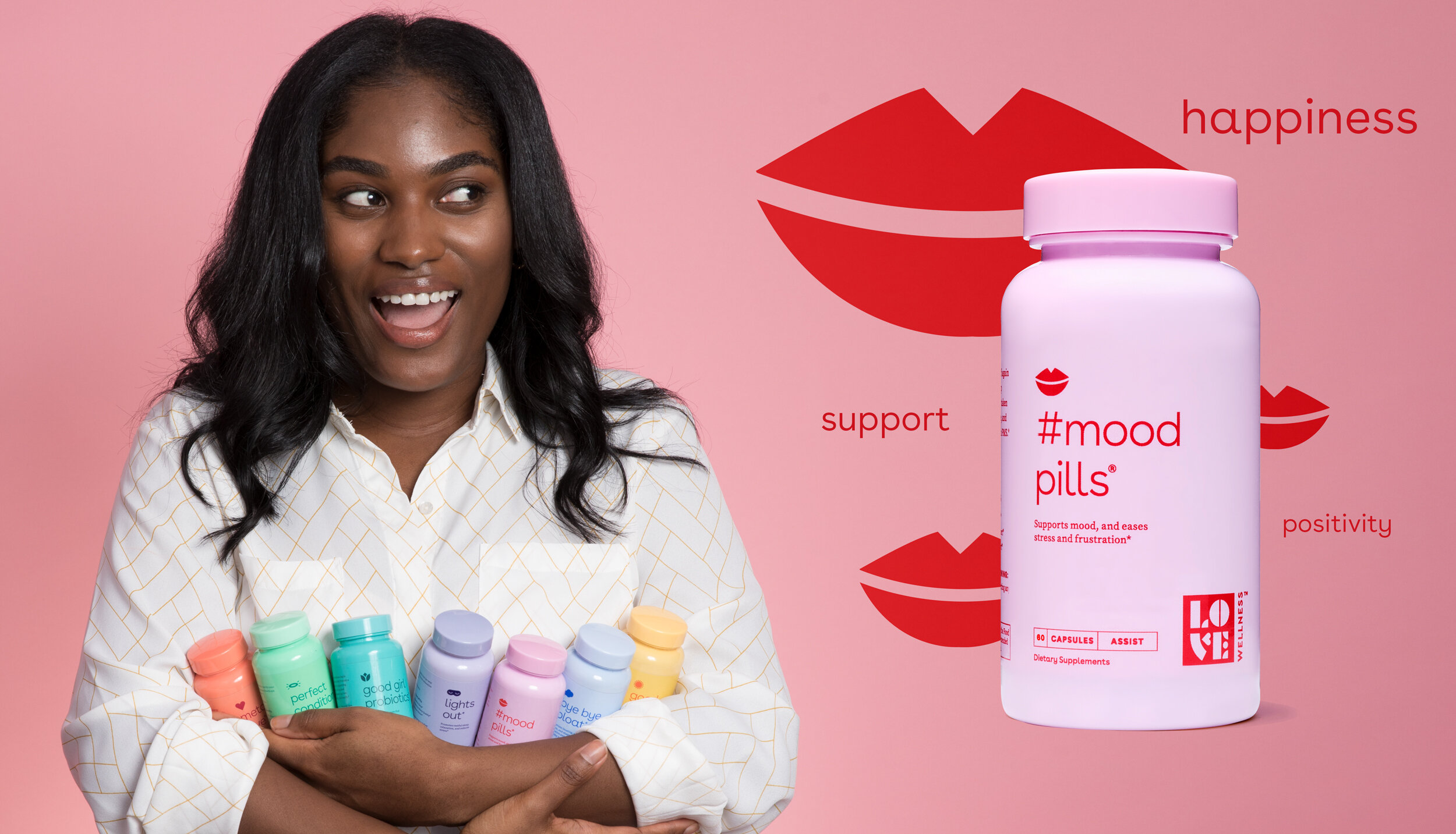
Even though the products they are selling fall under the traditional health & wellness umbrella, every element in the brand – from the product names to the colour palette to the photography – communicates their body-positive message and makes the products feel personal, bespoke and fun.
This brand radiates a warmth and authenticity that speaks to the female audience, and abandons any traditional corporate stereotypes that have a endency to creep into the health care sector.
5. Cheek & Humour
Humour is definitely not an element that is appropriate in every brand – however, there can sometimes be some fear or trepidation around using humour & cheek in a brand identity. And we don’t think there should be! Finding ways to work unexpected humour into brands & products can endear you to audiences and give your brand a unique personality.
Project that nailed it: We Compost
Agency that’s killing it: Seachange
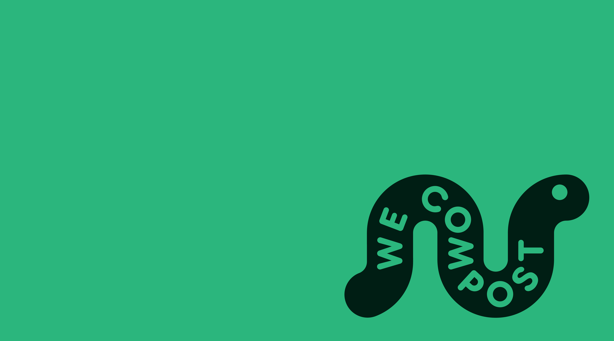
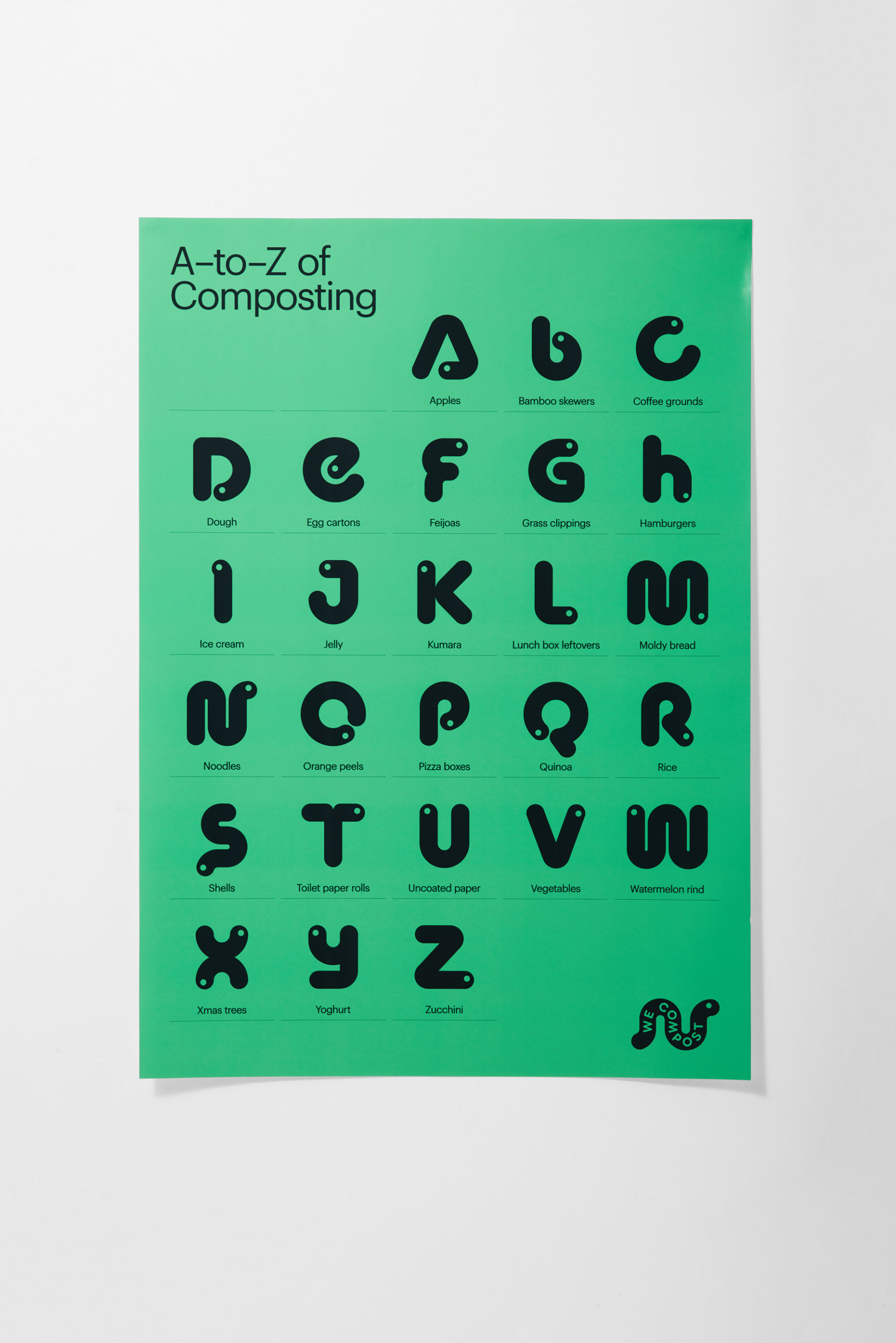
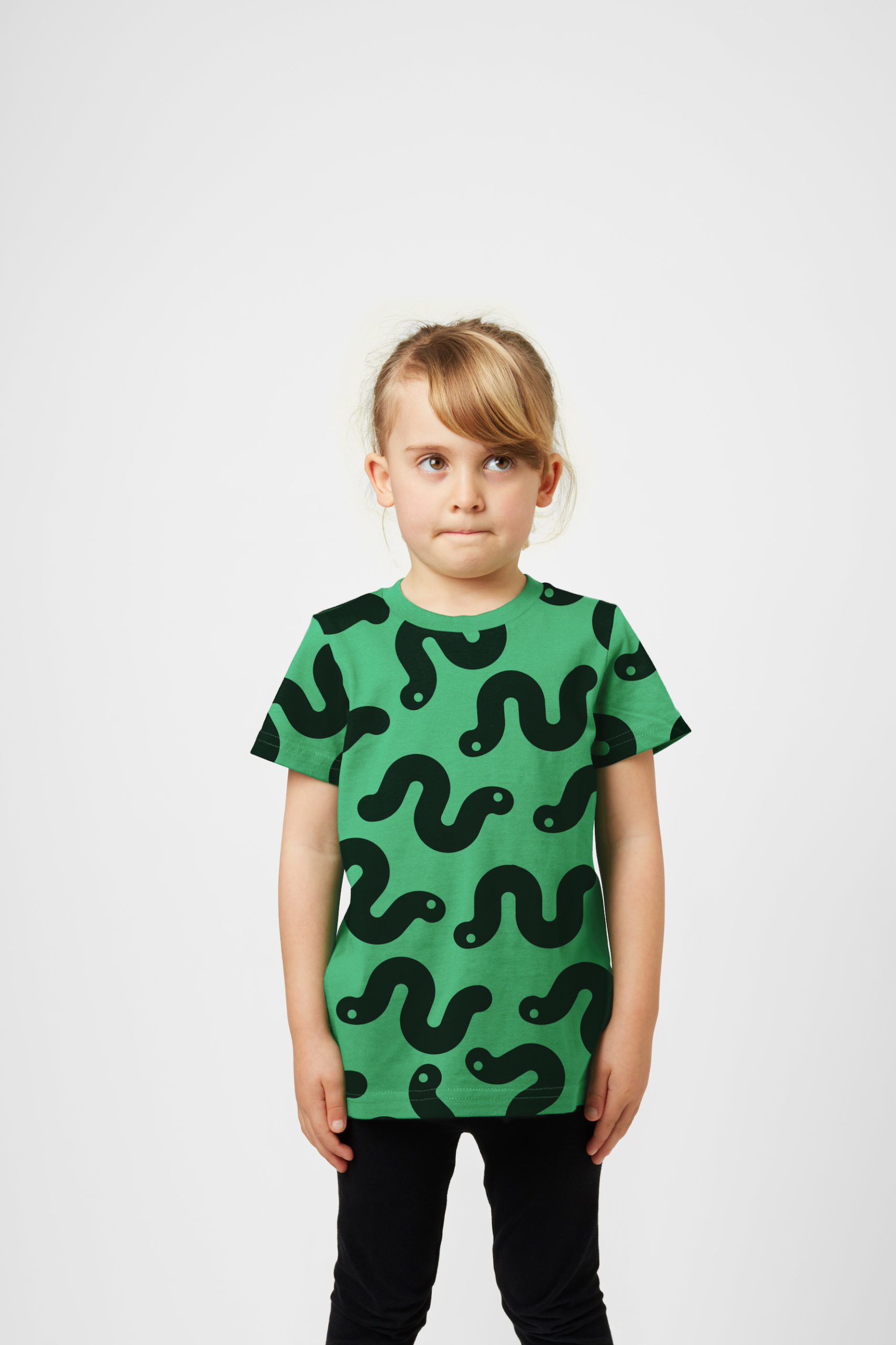
The most gratifying uses of humour in design usually appear in unexpected sectors – like waste collection & waste management for example! We Compost is Auckland’s leading commercial compostable waste collection service, and their branding designed by Seachange always makes us smile!
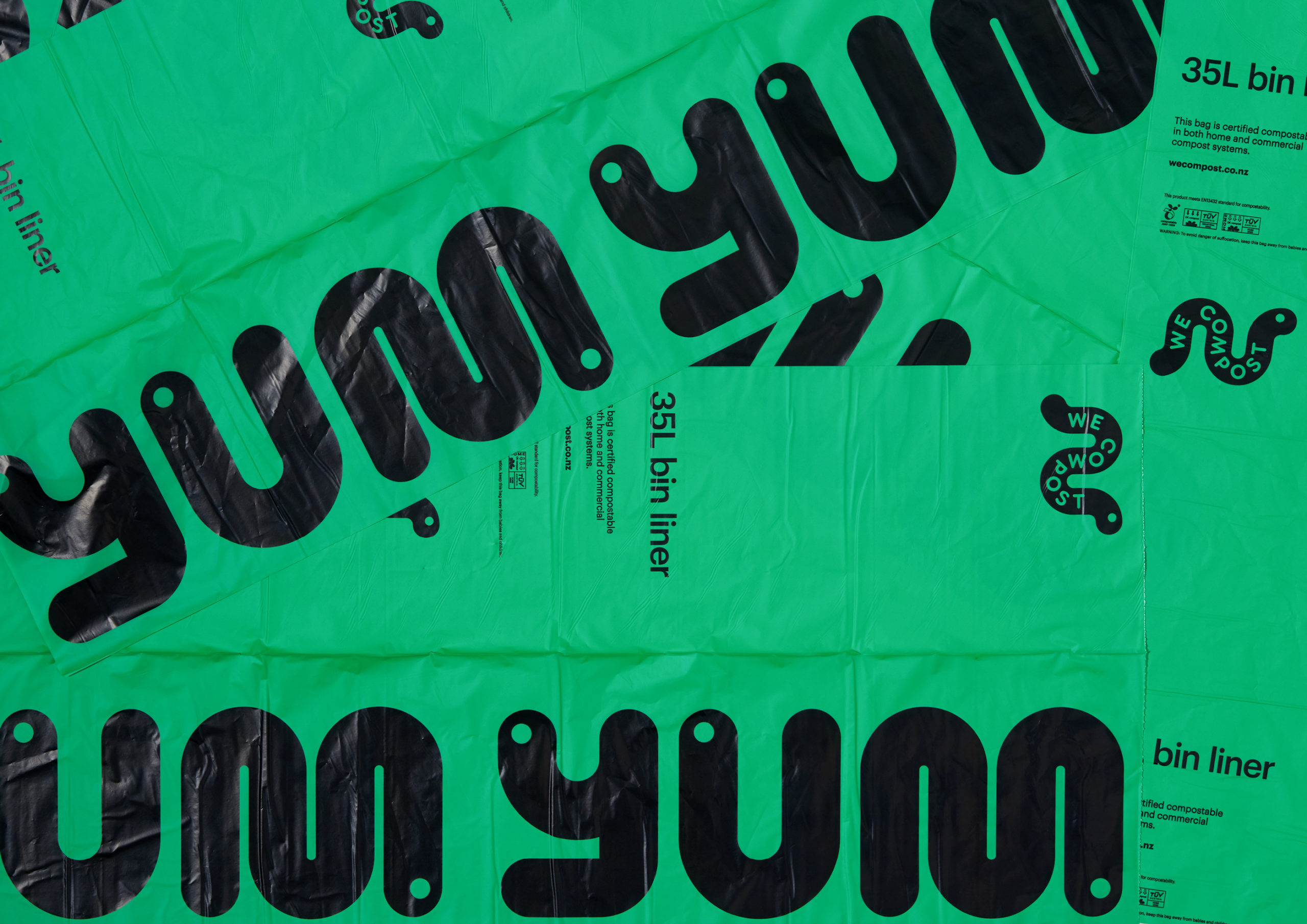
The use of a green seems like a no-brainer when it comes to compost, however the brand uses an unexpected bright emerald colour, paired with graphic black accents, giving the brand an edge we’re not accustomed to seeing in this sector.
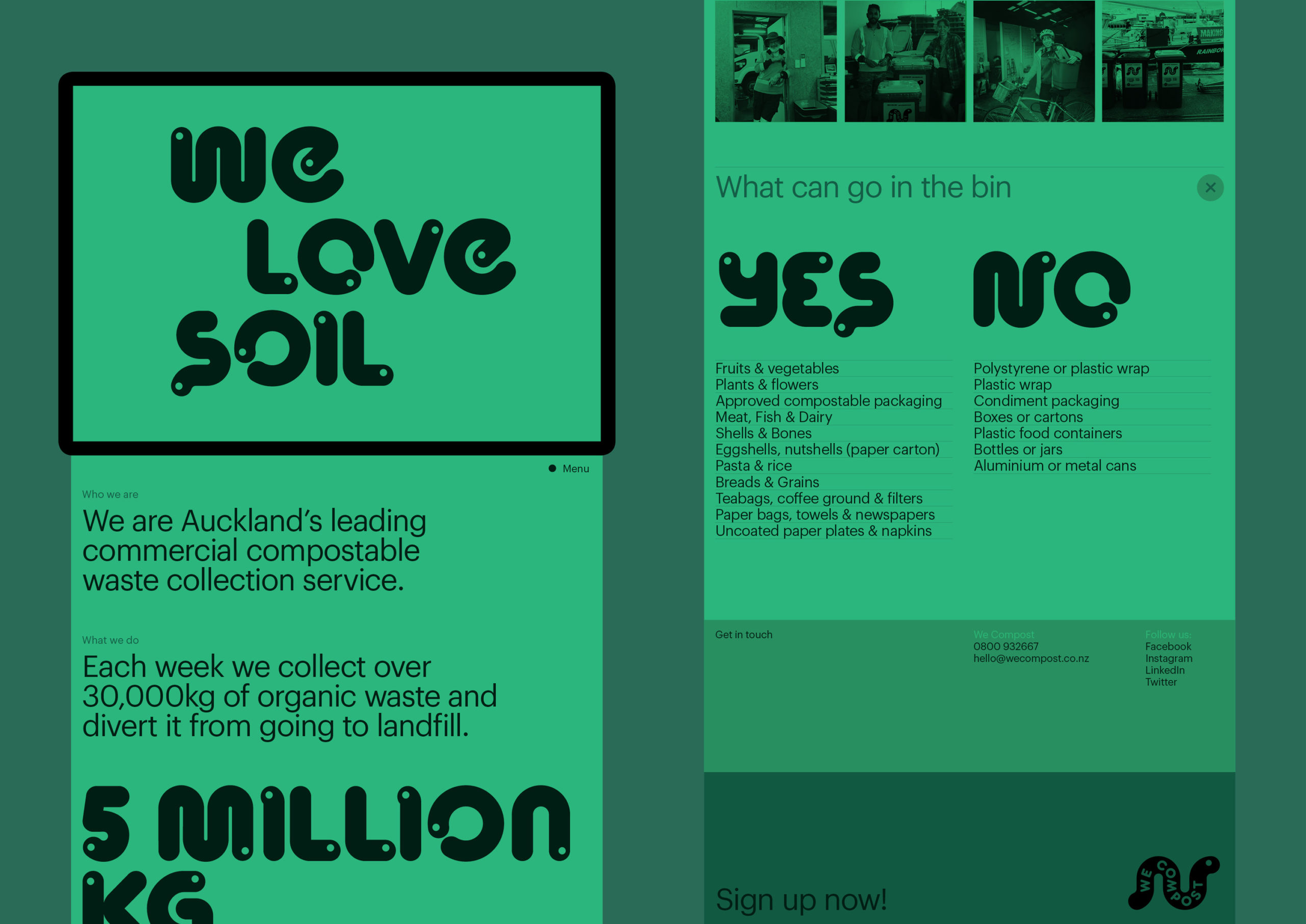
The humour really comes from the adorable worm graphics – a simple execution but so impactful. The worm motif is used in graphic applications, typography (the custom font is so cool) and messaging (We Love Soil!) which makes this brand holistic, fun and effective wherever it’s applied – from garbage bags to apparel to business cards.
6. Drama & Urgency
There can be a tendency in brand design – particularly in the not-for-profit sector – to go for visuals that feel safe & familiar. Lots of white space, light colours, sans-serif type – these elements can come together to create a nice brand that appeals and makes people feel comfortable – but what about the more urgent causes where we may need people to feel a bit uncomfortable? Creating urgency & drama in a brand can help you start a movement, and brands that use it correctly galvanize their audiences to volunteer, donate or advocate for their cause.
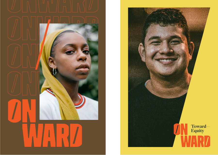
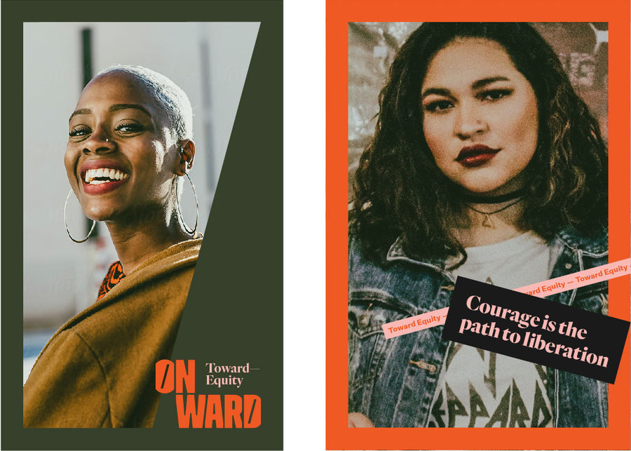
Project that nailed it: Onward
Agency that’s killing it: Firebelly
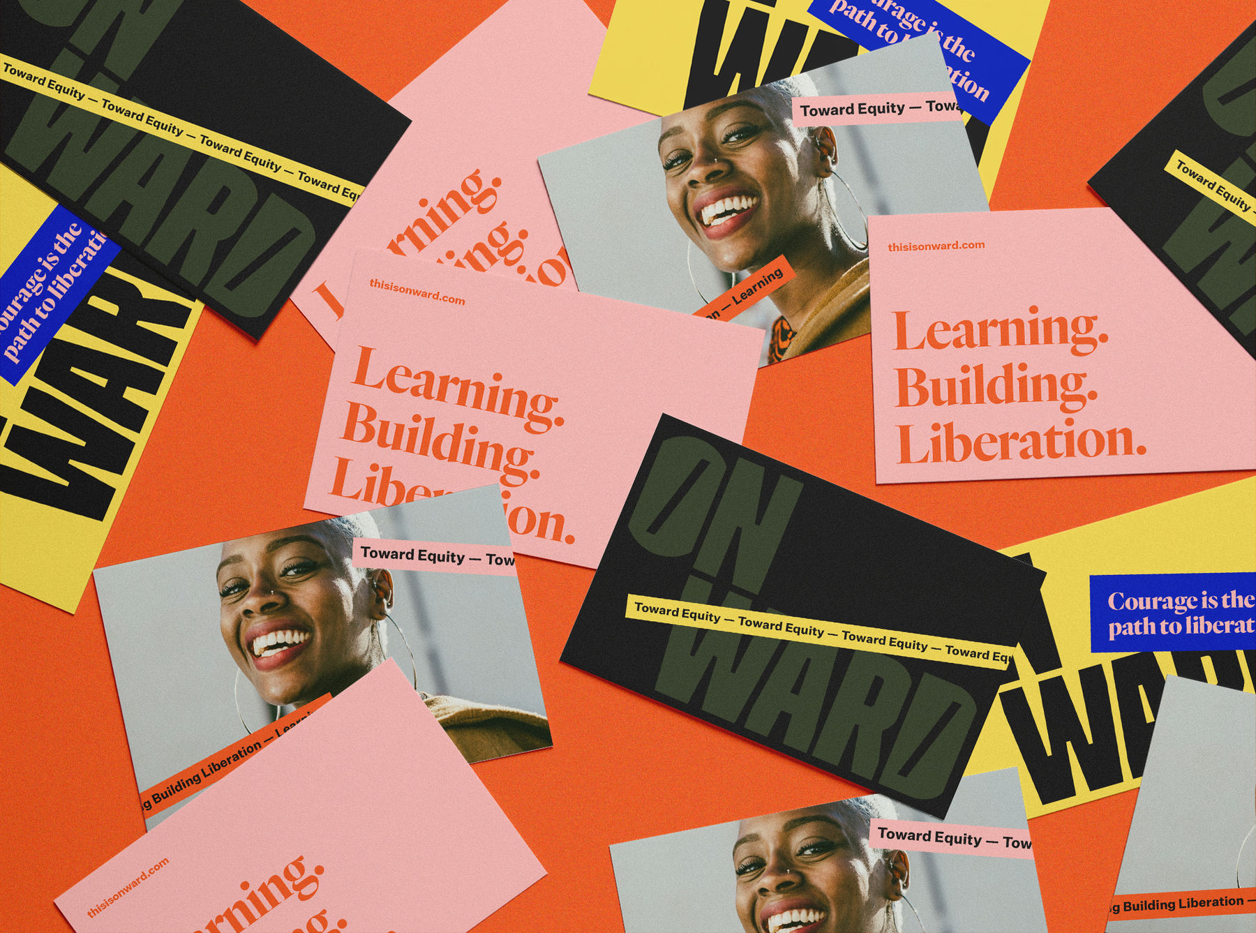
The brand identity for Onward – an organization that’s emboldening individuals and communities to dismantle systems of oppression through learning – is assertive & bold.

When designing the brand, Firebelly authentically captured the activist & inclusive mission by harking back to civil rights protest signs. The identity also mixes serif and sans-serif typography in brash, rule-breaking ways that give the brand an edge and disquiet.
The brand also utilizes angles to its advantage. Rotating elements at odd angles, instead of leaving everything at right angles, is an effective way to get people to stop and look because it does make us a bit uncomfortable. Adding these rotated elements to already bold typography and photography result in iconic visuals that have the drama & urgency to grow the Onward movement.
Lookout for future Loop roundups as we continue to grow our collection of inspiration, and thanks for letting us share our love of design for social good with you!
Loop is a creative design agency working in the design for social impact space. Let’s collaborate!