Get Personal 2: Social Enterprise Branding for Signalytic
Helping an innovative company spread the word about Digital Health Data Navigation
By Emma Steele | May 1, 2020
[ssba-buttons]
Financial limitations are one of the realities of design for social impact. Oftentimes not-profits, charities and social enterprises are built from the ground up by dedicated individuals, and initial investments or raised funds go directly to operations or causes, and not to things like identity and website design. But at Loop we know that design is a crucial part of how your organizations are perceived and how you communicate your message to the world.
As a Toronto design agency, it can be difficult to offer pro bono services to organizations that are just getting on their feet, but sometimes as individual designers, we have more opportunities to dedicate time after 5 p.m. to projects that inspire and excite us.
In this second edition of Get Personal, we’re talking to our Graphic Designer Emma Steele about a passion project she took on with Signalytic – an innovative new social enterprise providing digital health data navigation where it’s needed most.
![]()
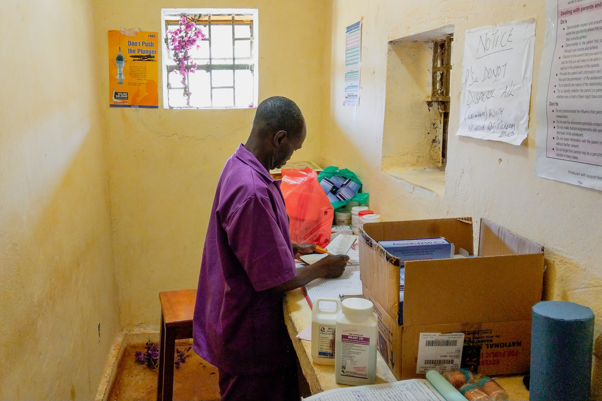
96% of preventable / treatable deaths in 2015 occurred in middle-income countries like Uganda, often due to poor access to or shortages of life-saving medicines. Signalytic partners with communities to implement technological solutions that bring health providers online, provide them with insights on stock and usage, and ultimately create self-reliant health-care economies.
How did you get involved with this project?
The team at Signalytic were already working with a friend of mine to improve their brand strategy and pitch materials in an effort to clarify their mission (the language for this type of service offering can be pretty technical), and it quickly became clear that they were definitely going to need a visual identity (or even just a logo!) to help present themselves to investors and potential partner communities. Once they explained what their cause and goals were, I was totally sold on the project and couldn’t wait to volunteer my time. I was excited to give a cool and innovative company an equally cool look that would help them garner more support and sort of set them apart in their more conservative market sector.
What inspired the identity?
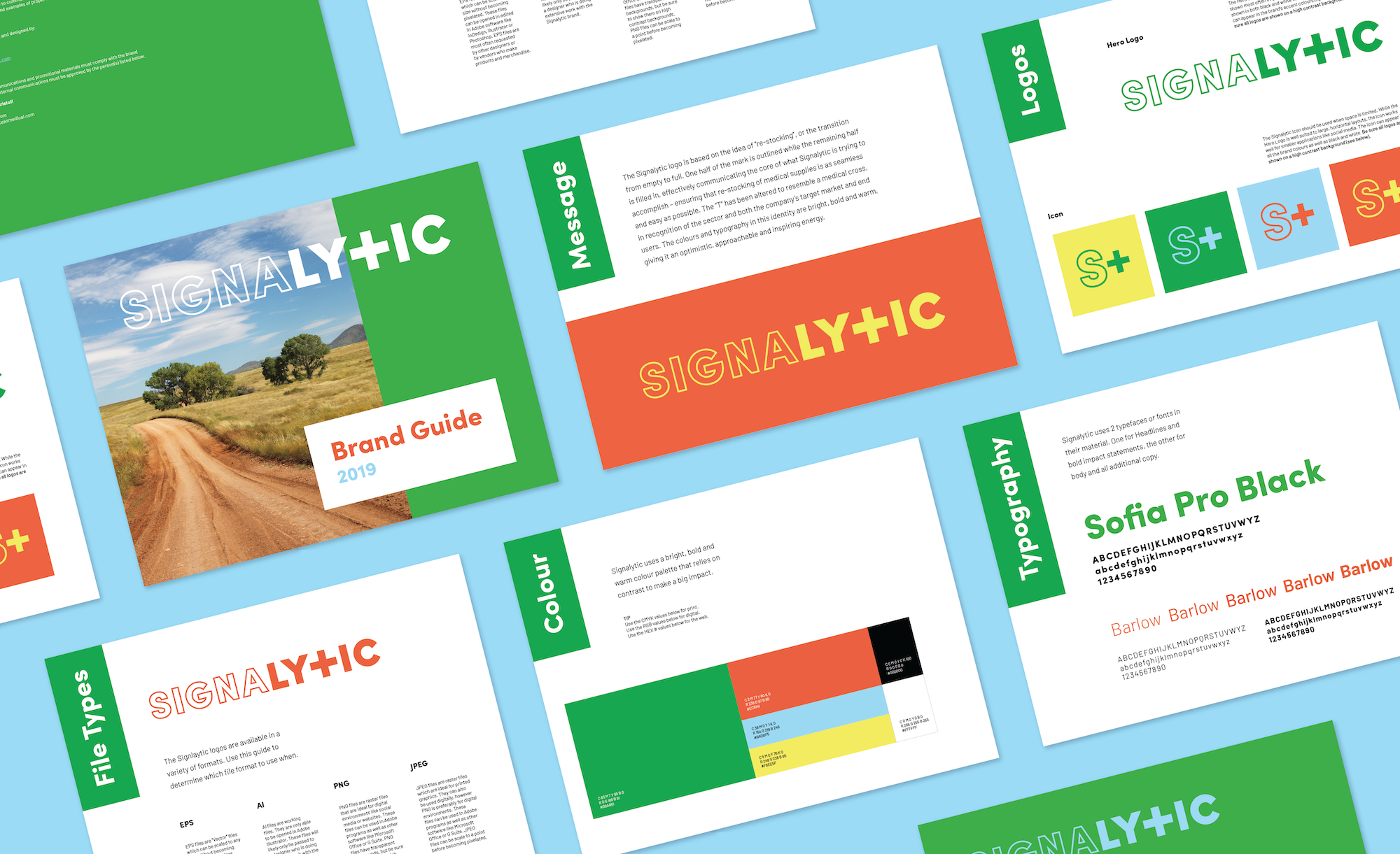
The Signalytic logo is a really simple, graphic mark that’s based on the idea of “re-stocking”. The mark is half empty and half full, which helps communicate what Signalytic is trying to accomplish – ensuring that re-stocking of medical supplies is as seamless and easy as possible. The “T” has also been altered to resemble a medical cross in recognition of their market sector, the target market, and their end users.
The colours in this identity are a break away from typical medical or technology aesthetics. They’re really bold and warm, giving the company as a whole this optimistic and inspiring energy. We also very intentionally chose 2 complementary colours as the primary brand palette so we would be able to designate one for explanations of the “Challenge” (orange) and one for the “Solution” (green) which was really useful when we began designing the website.
The identity – especially on the website – relies on large impactful typography that helps give their mission and challenge statistics emphasis and weight. We wanted these parts of the Signalytic material to be hard to ignore.
We also opted to utilize the team’s photos from their pilot project trip to Uganda instead of stock imagery. Although the pictures were mainly taken on phones, they actually help give the designs an honesty and urgency that stock photos just don’t capture.
The Signalytic icon was a natural offshoot of the primary logo, but the coolest part about it is that once it was designed, the icon helped inform the brand language. Their technology is now referred to as the “S+ Solution” – an easy and simplified way to refer to some pretty complex technological solutions. This just goes to show how good design can help bring about order and create a really tight brand experience.
How has Signalytic impacted you as a designer?
Designing for Signalytic has been a challenge and a joy. It can be difficult to design for initiatives that are very technical and hard to wrap your head around, but in the end it’s so worth the effort to play a small part in getting a project like this off the ground.
One of the best parts about being a designer with a focus on social good is that you get to use your creativity and skills to affect change in so many different areas that you probably never would have considered within your reach. You collaborate with people from all walks of life with different expertise and points of view who can teach you so much and help inform and deepen the meaning behind your designs.
Learn more about Signalytic by visiting their website.
Loop is a creative design agency working in the design for social impact space. Let’s collaborate!