Brand Identity
Connecting life’s unique moments with a community-lead platform
With Curiko
The brand and all touchpoints were shaped with input from teachers, supporters and indigenous artists
The Story
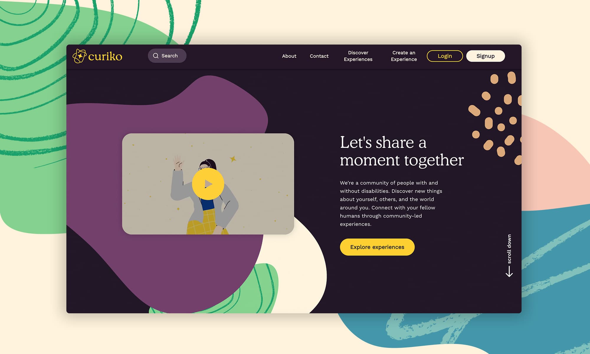
Curiko is a diverse community that brings together individuals with and without disabilities on a platform designed to create meaningful experiences, fostering self-discovery, and building connections with others and the world. In 2021, Loop crafted a comprehensive brand identity for this innovative platform, including the design of numerous UI elements for their website.
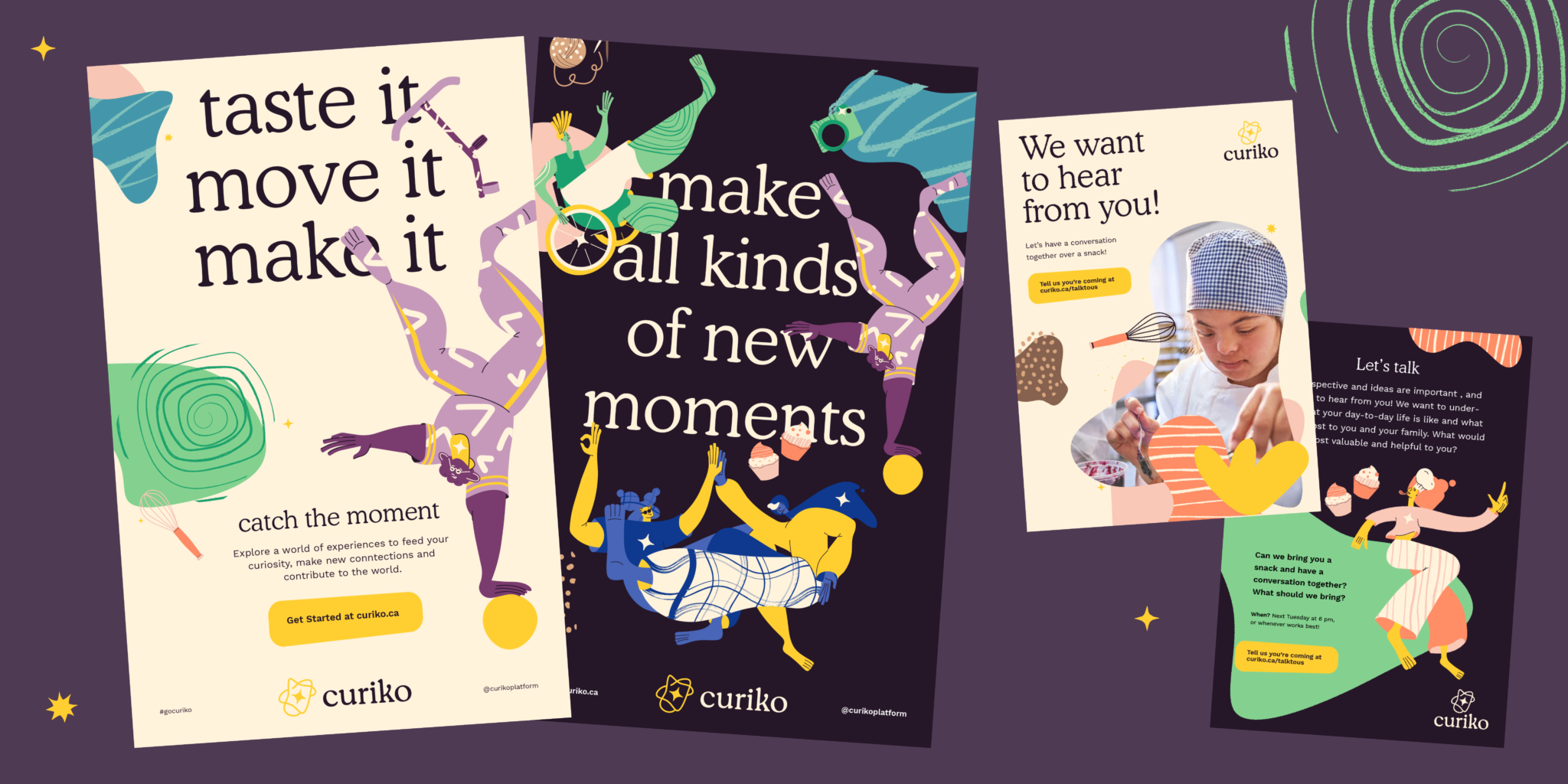
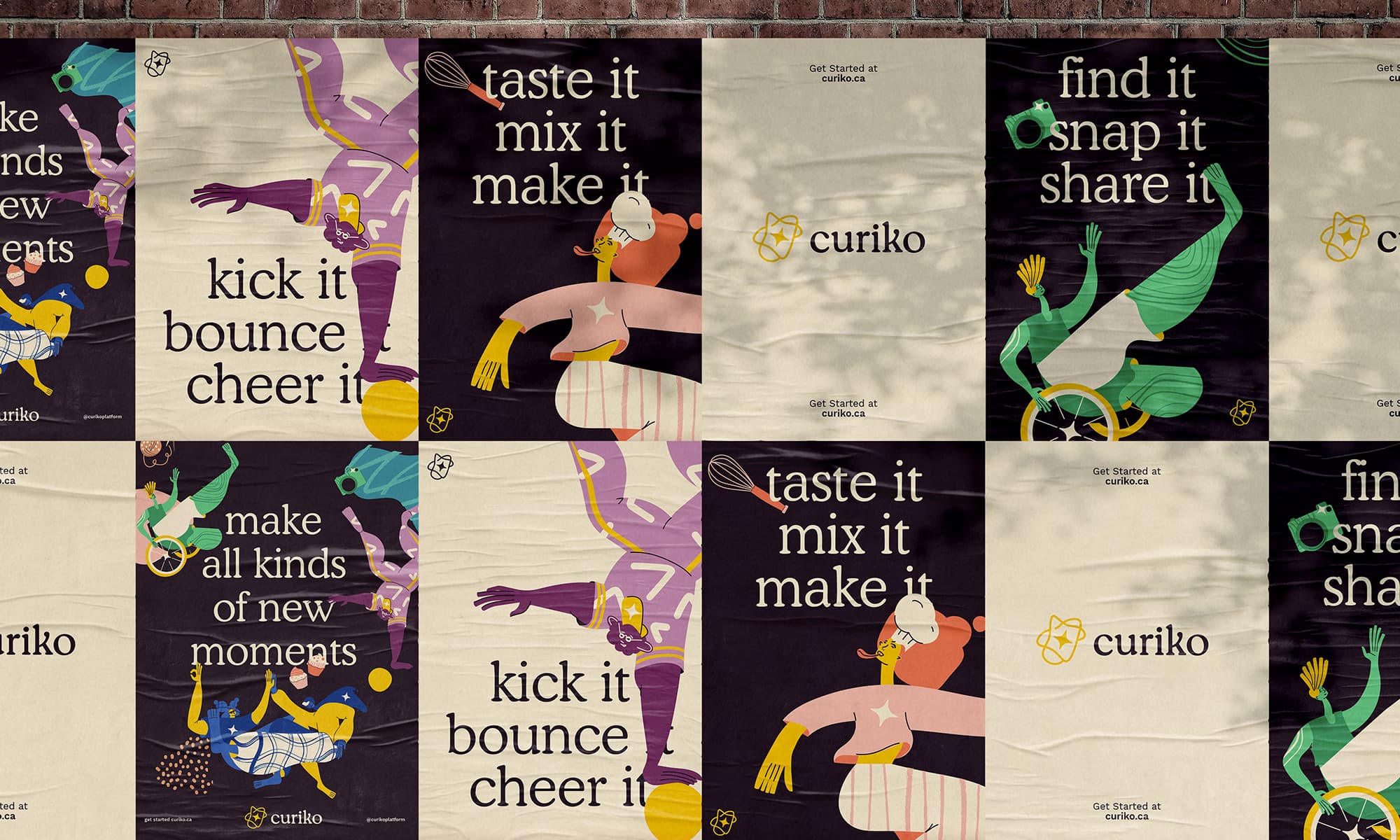
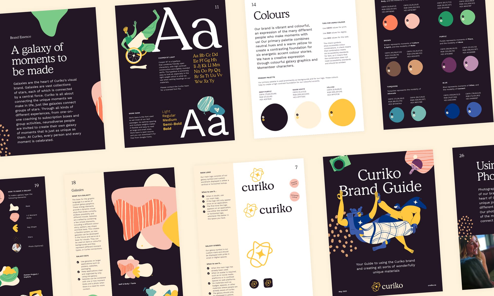
Central to Curiko’s visual brand is the concept of galaxies, which represent the unique moments we create in life and the connections between them. Just as galaxies connect groups of stars, Curiko connects people through various experiences. The Curiko logo features a galaxy symbol woven together from five distinct moments of connection, with a central star symbolizing new experiences enabled by Curiko. Each moment is represented by a unique shape, mirroring each person’s individual life journey. This symbol is complemented by a custom-drawn typeface that mirrors its fluidity and dynamism.
Curiko invites neurodiverse individuals to create their own galaxy of unique moments through a wide range of experiences, from one-on-one coaching to subscription boxes and group activities. Every person and moment is celebrated at Curiko, and the brand incorporates various elements to paint a picture of these unique experiences.
A welcoming, clear, and accessible typography system adds a unique personality to the brand. Combining a rounded and lively serif font with a crisp sans-serif font provides flexibility in communication. The brand is vibrant, energetic, and colorful, reflecting the diversity of people who create moments with Curiko.
Sector
Climate and Sustainability
Services
Brand Strategy
Visual Identity
Website
Timeframe
Since 2014
Relationship
Since 2014
Explore
Visit Website
The brand and all touchpoints were shaped with input from teachers, supporters and indigenous artists
The brand and all touchpoints were shaped with input from teachers, supporters and indigenous artists
The Curiko Logo, a shape woven together from moments of connection with a star in the middle, represents the new experiences that Curiko enables people to have.

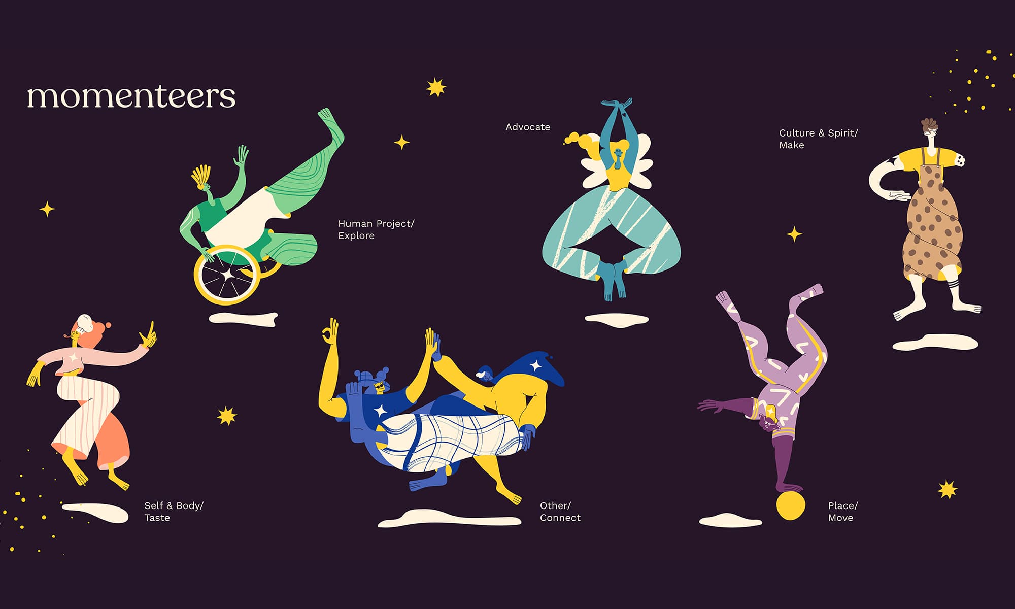
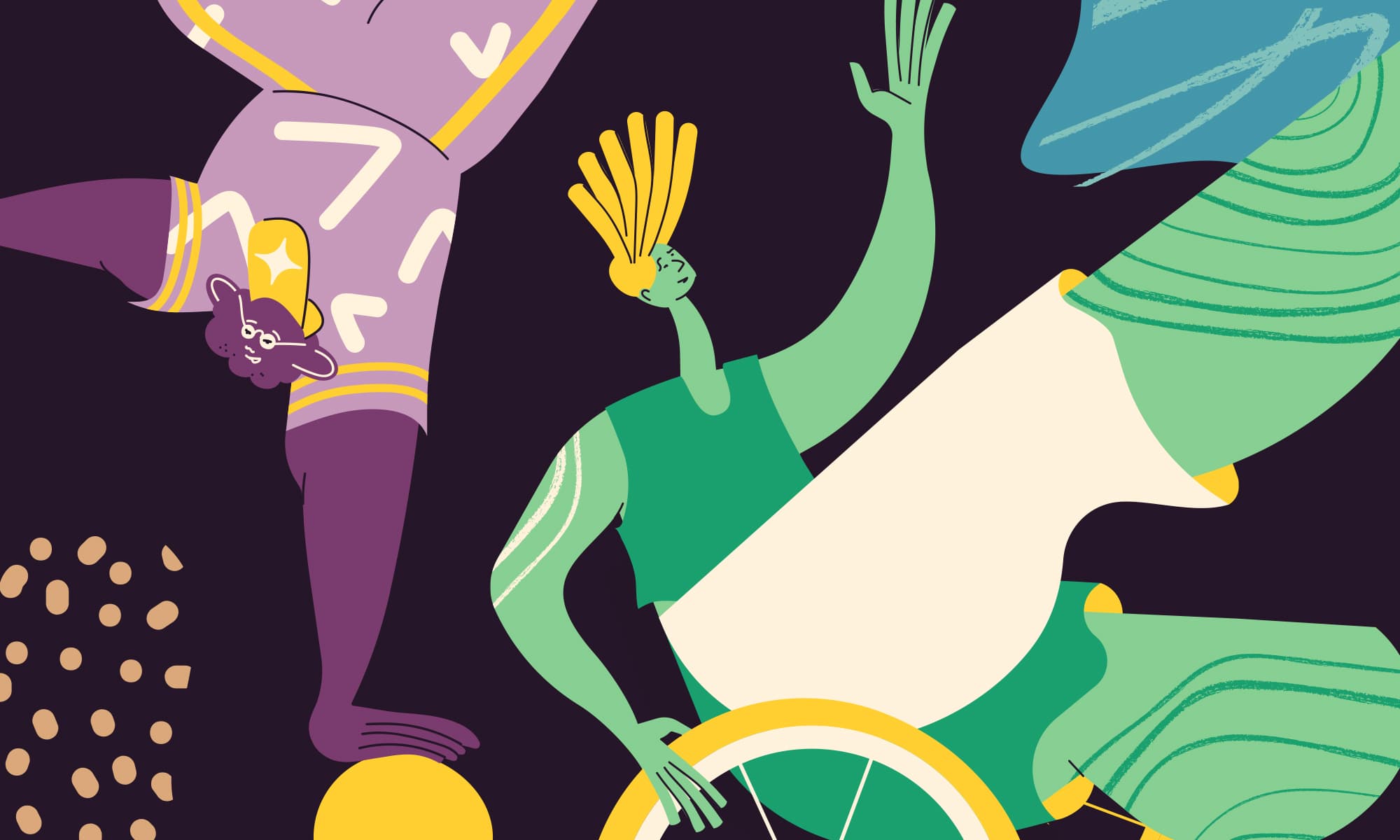
Momenteers are a collection of humanesque characters which provide a graphic punch to Curiko branded applications.
Making All Kinds of New Moments
The Curiko world comes to life with a collection of unique graphic elements that breathe life, energy and emotion into the brand. You can combine these elements in all kinds of ways to help create dynamic materials that all feel connected to the Curiko brand essence. Bringing together galaxies, moment blobs, images, Momenteers and custom icons, these energy elements provide a dynamic visual style that evoke curiosity, endless possibility and different moods.
The Momenteers are a collection of humanesque characters which provide context and graphic punch to applications. They help add a tangible or relatable element to the galaxy system, and create a unique and quirky personality for the brand. Each Momenteer represents one of Curiko’s modalities. A starting collection of icons are available to bring context to Momenteers and to their activities. Icons are colourful extensions of Momenteers, using the same patterns, colours and outlines.