Nonprofit Branding: Our Complete Guide and Best Examples
Learn more about nonprofit branding with our complete guide and best examples.
When you work at a nonprofit, standing out always seems like a priority.
This can be difficult when there are more than a million nonprofit organizations across the globe and likely thousands in your same sector or community.
An effective nonprofit branding strategy can help your organization stand out and allow your audiences to build more meaningful connections with you.
At Loop, we work with all sorts of mission-driven organizations to build and develop effective nonprofit brands. To help, we’ve put together this useful guide that will explore the following topics:
As you dive into the world of nonprofit branding and take a look at some successful examples, we hope you pick up some great ideas that will help your own nonprofit as well.
What is Nonprofit Branding?
Nonprofit branding is the way an organization communicates who they are and the heart of their work. It’s a promise to participants, partners, and supporters and encapsulates why these people should believe in them. It’s the way they position their nonprofit apart from every other organization out there.
These strategies often take a page from for-profit businesses as well. For example, picture the Nike brand. What comes to mind? Probably the iconic “swoosh” and corresponding “Just do it.” Nearly anyone would be able to match the two to the company they represent.
While big-name companies tend to have the most recognizable brands, other well-known nonprofits can stand out as well. Consider the bright red cross of the appropriately named Red Cross or the bright yellow jerry can of Charity: Water.
Yet while a nonprofit’s logo is a huge factor in its branding, it’s by no means the only element involved. Nonprofit branding encapsulates all of the overarching elements that an organization uses to communicate its mission, vision, and rally-cry.
Drafting Your Nonprofit Branding Guidelines
An effective nonprofit brand incorporates multiple cohesive aspects that come together to make up who your nonprofit “is.” Although a nonprofit brand can include many more elements, we’ll discuss a few of the most critical ones here. These include your organization’s:
Name
One of the most memorable elements of your nonprofit’s brand is its name. Choosing a name for your organization can be one of the most challenging things you can do as an organization. With so many potential directions, word associations, and language considerations, it’s important to choose a memorable name that aligns with your mission.
At this point, your nonprofit might already have a name that is well known among the communities you serve. However, if you decide that your name is no longer meeting your needs, if your mission or work has evolved, or you aren’t appealing to your audience in a meaningful way, a new name can bring fresh momentum into your brand.
For example, WWF, founded in 1961, changed its name from the World Wildlife Fund to the World Wide Fund for Nature in 1986. This was done to better encapsulate the full scope of its mission and maintain the same iconic initials that it is known for across the planet.
Logo
Your organization’s logo is the foundation of your overall visual brand. It will also likely incorporate a number of other branding elements, such as your name, colour scheme, and a tagline to ensure cohesion and recognizability.
Whether your logo is a wordmark or a symbol-based mark, it should represent the essence of your mission and brand personality. When included in your marketing materials, printed collateral, website, and more, your logo should elicit immediate brand recognition and build an emotional connection with your organization.
Nonprofit logos can take all kinds of visual directions. However, the most effective ones tend to incorporate elements related to the organization’s mission, such as the wheat icon in the Feeding America logo or the home graphic Habitat for Humanity uses.
Typography
Your nonprofit’s typography expresses your organization’s personality through written elements of your brand and how your copy is styled and arranged. This includes choices of typefaces (i.e., families of related fonts), stylization (i.e. capitalization), and hierarchy.
Your typographic decisions have a significant impact on your overall brand experience and the feelings that it elicits. Different typeface systems speak with their own distinct tone, and this tone should directly reflect your brand.
For example, if your nonprofit speaks with a loud, advocacy-based tone, a strong vertical typeface in bold weights may convey urgency and action. On the other hand, a children’s charity might use a more geometric typeface with a lighter weight to convey a calmer tone.
Ensuring your typography is readable and accessible, both digitally and in print, is critical to making sure that your most important messages and calls to action are clear for everyone.
Colour
Your organization’s colour palette should be chosen with care, considering more than just what looks nice together. Each possible colour comes with its own nuances and subconscious characteristics to take into account:
Red: Red is bold and often used to represent big emotions such as passion, strength, violence, and health.
Orange: Orange represents a friendly and playful tone and is often full of energy.
Yellow: Yellow is linked to the sun and brings about feelings of warmth, happiness, and optimism.
Green: Green encompasses growth and prosperity, often in relation to climate and environment—making it a great choice for conservation-related causes.
Blue: Blue offers a wide range of meanings, including tranquility, trust, and professionalism.
Purple: Purple signifies innovation, a great choice for solutions-oriented brands.
Pink: Pink typically represents creativity, innovation, and is the colour of many movements in the 2SLGBTQ+ space.
Black: Black is typically representative of bold and serious brands.
When choosing a colour palette, it’s important to consider common associations to certain colours (i.e. political parties or campaigns, like the pink ribbon for breast cancer) before making important selections.
While many organizations often choose a core colour, with a secondary palette of accompanying hues, there are no limits to the colours you can choose to include in your brand. What’s most important is that your palette meets colour contrast and other accessibility standards, so that people can see and interact with colour in ways that work for them.
Positioning
Your nonprofit’s positioning communicates what makes your organization unique and distinguishes it from its peers. Your position becomes a roadmap for the organization, and everything that you do or create should reinforce it. Nonprofit positioning tends to differ from that of the for-profit world due to its focus on collaboration rather than competition.
For example, if you operate a local food bank, you likely consider the other pantry down the road to be a partner rather than a competitor. After all, you’re all working towards a common goal: feeding your community.
It’s still important that you have a dedicated positioning strategy that answers the question of, “if there’s already another nonprofit with a similar mission, why do you need to exist?” At this stage, it comes down to what makes you unique, and what makes supporting your cause the best possible choice.
Personality/Tone
Your nonprofit’s personality and tone of voice go hand in hand, and each is important for a successful nonprofit branding strategy.
Personality refers to the humanization of your brand through emotions and other personal characteristics such as sincerity, inclusivity, and optimism. This makes up your nonprofit’s identity and welcomes your audience to connect with you.
Your tone of voice, on the other hand, is the tangible expression of your personality. This comes out in the way you speak, write, and otherwise discuss your organization with your audience.
Overarching Message
Brand messaging encapsulates your organization’s mission, vision, and key values. Your overarching message may express itself in a variety of ways. For example, it may manifest in short and memorable taglines, or expand to form a fulsome brand story that communicates to the world why you exist and how to rally action around your cause.
As you develop your nonprofit brand message, be sure to consider your organization’s programming and benefits as well as overall style. It can also be useful to draft an elevator pitch to kickstart your messaging development.
Creating a Nonprofit Branding Strategy
Nonprofit branding is an involved process that works best when done collaboratively by engaging a cross-section of your organization. As you develop your own nonprofit’s brand, keep the following tips in mind.
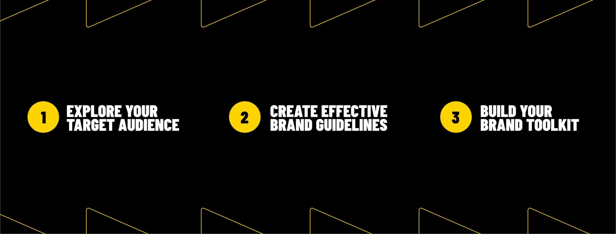
1. Explore your organization’s target audience.
Your nonprofit’s target audience is one of the most critical components to consider when crafting or updating your branding strategy.
Before you can start building your brand identity, you’ll need to first narrow down your audience to a specific group of people who are most likely to engage with your organization and its services. For example, does your programming cater to youth in the Toronto area? Middle-aged women across Canada? Income-challenged families throughout Ontario?
Once you’ve identified your target audience, consider what it is that they will connect with. Even better, engage them in the process of developing and testing brand messaging and visuals.
2. Create a living document with your nonprofit branding guidelines.
Your nonprofit branding strategy is likely to change over time to keep up with your evolving priorities and circumstances and continue to appeal to your audience. In order to keep up with every aspect of your brand, create a single document with all of your relevant branding information, including:
Your story: Describe what you want your nonprofit to be known for and how it’s different from other organizations with similar missions.
Mission statement: Your nonprofit’s mission statement should not just be included, but might also guide other branding decisions as you establish the story and purpose of your organization.
Colors: Choose a color with a connotation that matches your story or voice. For example, an environmental nonprofit might choose shades of green.
Fonts: The fonts you choose should represent the tone your nonprofit aims to present. For example, rounded edges and softer lines look softer and more friendly.
Logo: Include your nonprofit’s logo and any variations with contingencies about how the logo should be used.
Then, share this document with your entire marketing team as well as board members, leaders, and other key stakeholders. And don’t forget to update it as you make your branding changes going forward! If you redesign your organization’s logo or adjust your main colour scheme, it’s vital that these changes are reflected in your branding document.
3. Build a brand kit.
To make sure your guidelines are used consistently across communication channels, create a brand kit that establishes rules for how the guidelines should be used.
For example, your nonprofit’s website needs to fall in line with the rest of your marketing materials. It should follow the same colour scheme and overall design that your audience has seen across social media, direct mail, and signage. That way, site visitors will associate those brand elements with your organization, no matter where they see them, and be more inclined to give their support.
Promoting Your Nonprofit’s Brand
One of the most essential functions of a nonprofit brand—or any brand, for that matter—is its ability for people to recognize and connect it back to your organization.
Building brand awareness ensures that all of your hard work in building a consistent, cohesive brand identity doesn’t go unnoticed. When supporters are familiar with your nonprofit’s brand, they’re more likely to remember your organization and its mission. Additionally, increased awareness will support your other marketing efforts and give your organization a concrete, personable identity that supporters can connect with.
Some of the most critical ways to promote your nonprofit’s brand include:
Focusing on search engine performance.31% of people discover new brands and products via search engines, making this platform the top way most users build brand awareness. As a nonprofit organization, you could be eligible for the Google Ad Grants program, which provides $10,000 in Google Ad credits each month. With these paid ads, your nonprofit’s website could land at the top of the results page for a relevant keyword, sharing your branding with more current and prospective supporters.
Learning and adjusting your approach. The best way to make sure your brand resonates with supporters is by getting their feedback. As you learn more about what works and what doesn’t, you can optimize the channels you’re using to promote your brand. For example, by optimizing your Google Ads according to search queries related to your mission, your website might reach more internet searchers.
Having two-way conversations. Socialize with your supporters outside of simply requesting a donation or asking them to volunteer. A good way to facilitate these connections is by asking questions on social media posts and replying to supporters’ comments. Over time, your supporters will develop a deeper relationship with your brand and learn more about your values. Plus, you’ll grow your online presence and number of connections.
Establishing multiple touchpoints with donors. If the only time you were exposed to a brand was through promotional emails, would you remember the brand? Probably not. Instead, strive to be the organization that is present across many different channels so supporters see your brand on their social media feeds, SMS messages, direct mail, and more.
Understanding the ins and outs of nonprofit branding can be difficult on your own, which is why many organizations look to agencies, like Loop, that specialize in just that. When you work with a nonprofit-specific branding agency, they can help you develop or update your organization’s branding guidelines, imagery, and more. Plus, they tend to understand what strategies work best for organizations like yours and can provide you with expert advice for long-term success, including how to effectively engage different audiences and stakeholders in the process.
At Loop, we’ve worked with countless nonprofits, from local grassroots organizations up to multi-national nonprofits addressing global issues, to help hone in on what makes them unique and communicate that to the world. Take a look at some of our case studies or get in touch to learn more about how the process works. To guide the conversation, we always recommend drafting Request For Proposals and outlining your unique goals and needs prior to reaching out.
Inspirational Nonprofit Branding Examples
Are you looking for inspiration to take your nonprofit’s brand to the next level? These organizations are making an impact through thoughtful branding strategies, and Loop is proud to have supported them on their journeys:
Gakino’ammage: Teach for Canada
Gakino’ammage: Teach for Canada is dedicated to creating equitable education opportunities for students in Northern First Nations communities. Their team wanted a nonprofit brand that authentically reflected the communities they serve while equipping them with tools to communicate their mission effectively.
The brand discovery process was a collaborative effort between Gakino’ammage: Teach for Canada and Loop. We worked closely with teachers, community leaders, and Indigenous artists to gather insights and ensure the brand resonated deeply with its target audience. At the center of the identity is the logo, featuring one Canada goose leading another as they fly north—a symbol of mentorship and collaboration between teachers and students. The bold red colour evokes passion for education, and creating variations in Ojibwe, English, and French reflects the cultural and linguistic diversity of their audience.
Graphic elements inspired by the motion of geese in flight, paired with a flexible color palette, custom iconography, and patterns, form a cohesive system. An easy-to-use brand guide empowers the team with tools to apply their identity consistently across materials, helping them build meaningful connections with educators, students, and supporters.
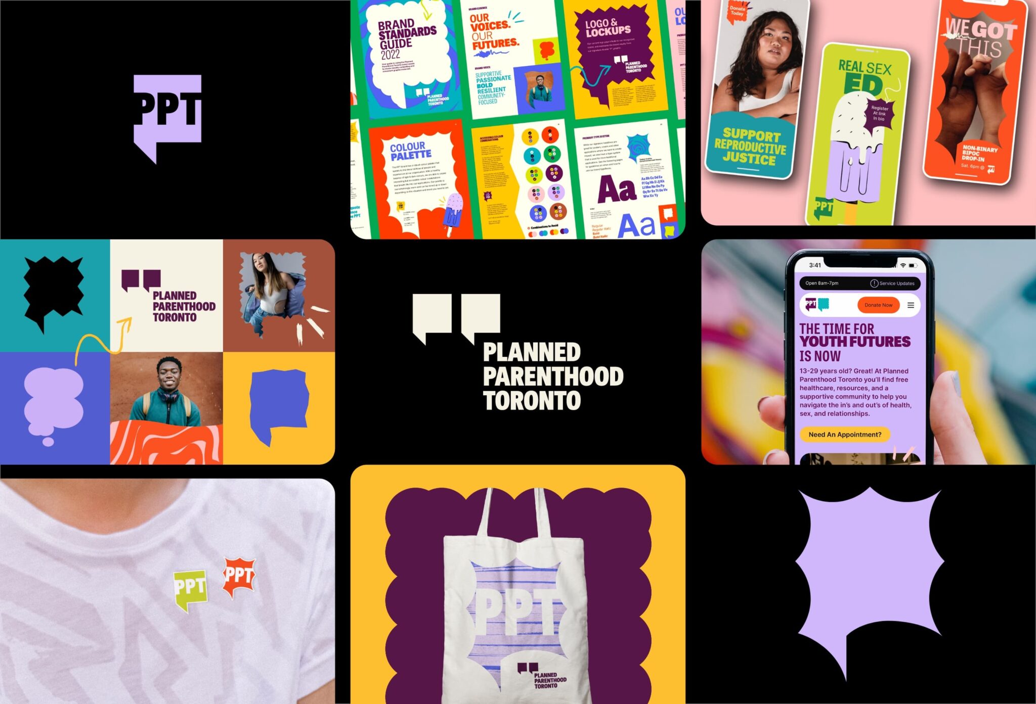
Planned Parenthood Toronto (PPT)
Planned Parenthood Toronto is a trusted resource for sexual wellness and reproductive justice, serving young people in the Greater Toronto Area. Upon partnering with Loop, their team needed a brand that felt bold, youthful, and reflective of their diverse audience while being flexible enough to meet the demands of advocacy, community care, and policy work.
In their new brand, a core image is a speech bubble graphic symbolizing the diverse voices and health needs within their community. This adaptable element, featured in the logo and other branded materials, communicates that young people have a voice in shaping their futures. A vibrant color palette and bold typography add energy and flexibility, allowing the team to balance offering empathetic support with advocating for policy change. By combining structure with adaptability, PPT’s refreshed brand empowers their team to create materials easily that amplify their mission and connect with their audience.
Curiko
Curiko brings people of all abilities together to foster connection and self-discovery across Canada. When they turned to Loop, their team needed a brand that captured the vibrancy of their platform while equipping them with tools to visually express their mission.
Their new logo—a galaxy with a central star—represents Curiko’s focus on connectedness and possibility. Custom typography enhances the brand’s welcoming and accessible feel, while a team of playful illustrated characters, called Momenteers, helps tell the stories of their community. These elements come together in a joyful, flexible brand system that makes it easy for the team to reflect their mission in everything they create, while inspiring people of all abilities to see themselves in Curiko’s story.
Community Forests International
Community Forests International works with communities in Canada and Zanzibar to protect and restore forests. Their team wanted a brand that helped them connect authentically with supporters across these two distinct regions while avoiding greenwashing.
Their new logo—a tree formed from two upside-down hearts—embodies their values of leading with love and fostering connection beyond borders. Another key brand asset is a collection of imagery—the “Legacy Illustration”—that highlights the various aspects of the organization’s environmental work and story through modular tiles that highlight geographies and forest systems. These adaptable elements, created through their collaboration with Loop, allow the team to consistently share their message and apply the brand across a wide range of platforms, ensuring their identity feels unified and authentic, no matter the audience.
International Institute for Sustainable Development (IISD)
The International Institute for Sustainable Development (IISD) is a global think tank addressing complex challenges in sustainability and economic equity. Their team partnered with Loop to create a brand that reflected their bold, solutions-driven approach while providing a strong foundation for sub-program identities.
The updated logo—a split circle tilted to reflect Earth’s 23.5-degree axis—symbolizes their global focus and vision for transformative change. It doubles as a framing device for their photography, visually connecting humanity and the environment. A blue colour palette conveys trust and professionalism, while clean, modern typography underscores their innovative nature. Together, these elements form a cohesive system that makes it easy to maintain consistency across local, national, and global platforms, empowering IISD to bring bold solutions to life.
Your nonprofit branding is core to who you are. In order to keep up with the changing demands of the world around you, it’s important that your nonprofit brand continues to evolve as well. We hope these tips and examples will help your organization in its journey toward a unique and effective brand strategy.
For more information or to kickstart your own nonprofit branding process, be sure to explore our other educational resources:
Our Creative Process: Designers in Conversation.Take a behind-the-scenes tour with the Loop team to discover what the creative process looks like and how we get started with a new project like yours.

 1. Explore your organization’s target audience.
 Planned Parenthood Toronto is a trusted resource for sexual wellness and reproductive justice, serving young people in the Greater Toronto Area. Upon partnering with Loop, their team needed a brand that felt bold, youthful, and reflective of their diverse audience while being flexible enough to meet the demands of advocacy, community care, and policy work.


