Brand Identity
Branding a bold and resilient voice for reproductive justice.
with Planned Parenthood Toronto

Planned Parenthood Toronto is a community health centre dedicated to fostering an inclusive and holistic approach to sexual and reproductive health for young people aged 13-29. Working closely with the PPT team, Loop worked to create a brand refresh that captures their growing services and commitment to addressing social determinants of health, including mental health, primary health care, securing housing & employment, and navigating the health care system.
With a focus on Toronto’s underserved populations, PPT’s goal is to empower young people to take control of their health. Their brand is a bold reflection of their mission and the diverse members of the communities they serve.


A New Voice
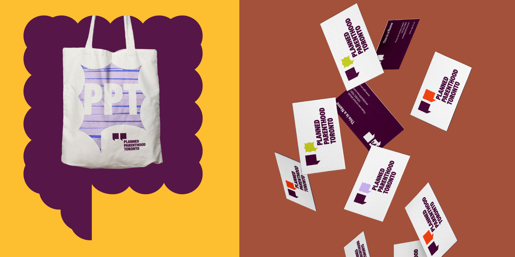
The new PPT brand is electric and bold, just like their community. When creating the logo for the refreshed PPT brand, we wanted to bring the double “P” icon to new heights emphasizing the strength of the organization and its roots. In this identity, the focus is the idea of a speech bubble or voice box that represents the different voices that make up the Planned Parenthood Toronto community.
In addition to the primary logo system, a dynamic, flexible logo system transforms the logo to fit any situation or mood that represent the many voices PPT celebrates. This visual metaphor extends to the larger brand and is the foundation of the brand language.

A Vibrant Voice for Youth Futures
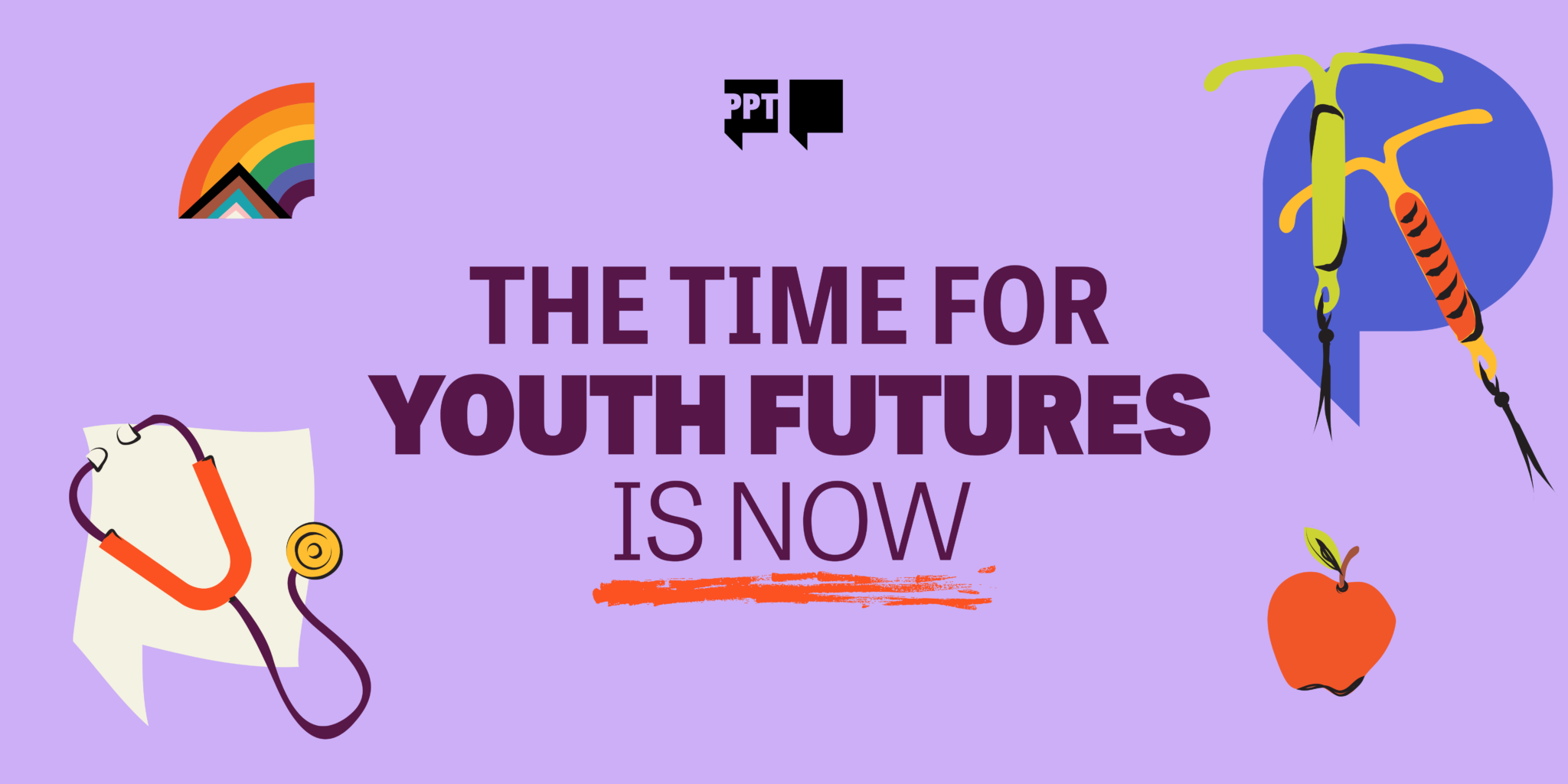
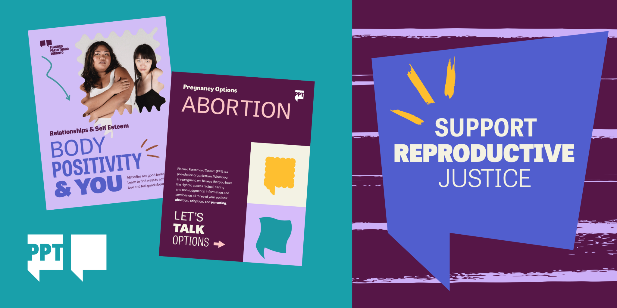
The brand centrepiece is the Voice Boxes – a bank of unique geometric shapes that can be used in different ways in combination with text & images. Inspired by the form of the logo icon, each voice box is unique and helps set a different tone or mood. Combined with patterns, notations and illustrations, a large bank of graphic solutions breathe life into this dynamic and unique organization.

We All Have a Voice
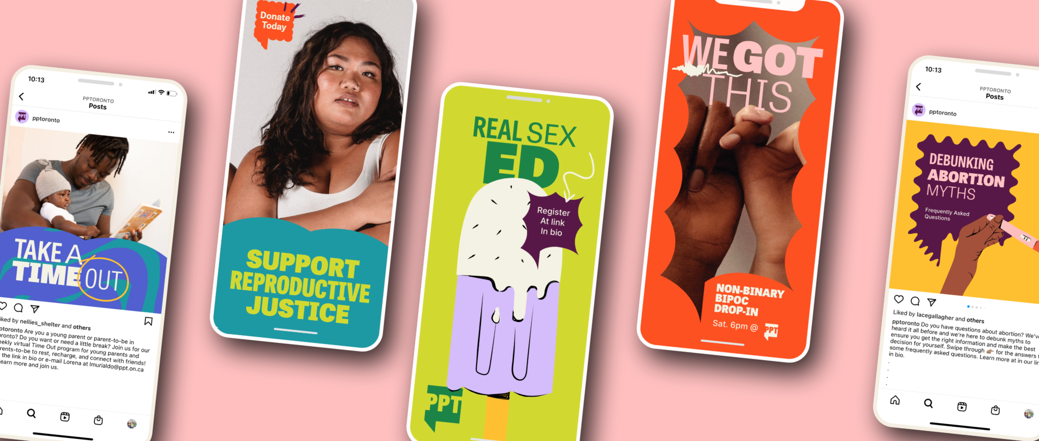
The PPT graphic language speaks to the rainbow of people and experiences that come in through their doors. Each application allows youth to feel represented through dynamic patterns, illustrations and imagery. Catering to the wide variety of their service offerings, the PPT brand can be modified to communicate different tones from a softer, more understated supportive voice to a bold and unapologetic advocacy voice. With a robust colour palette, a lively and dynamic typography system, Planned Parenthood’s unique voice shines through.
From Empathy to Impact
The new brand for Planned Parenthood Toronto has been rolled out with great joy and excitement, and has helped reinvigorate their long time supporters and major donors who feel excited by and reflected in the brand.
Thank you Planned Parenthood Toronto!
