Brand Identity and Web Design
Building a trellis of support and foundations for growth
With Trellis HIV and Community Care
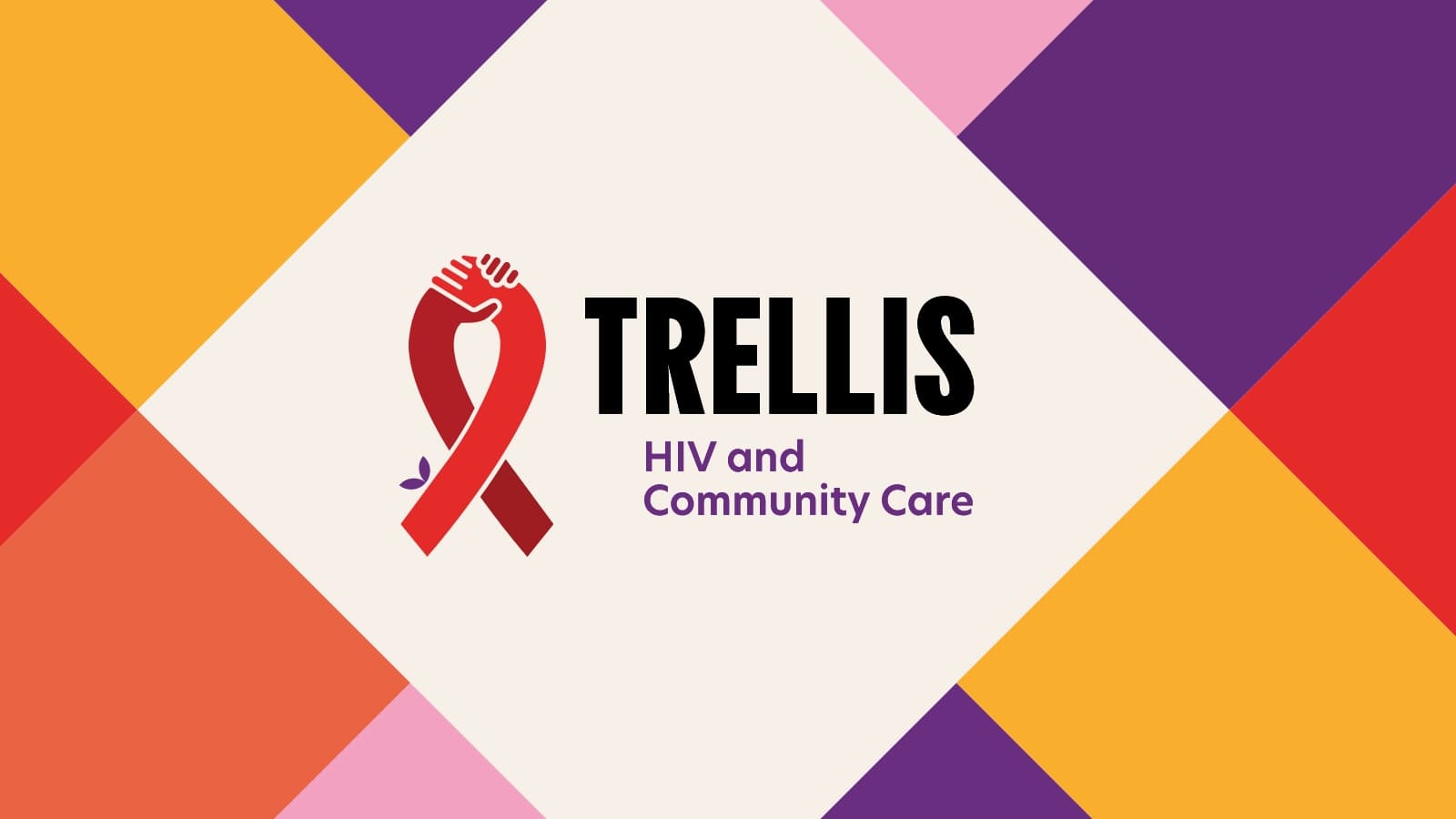
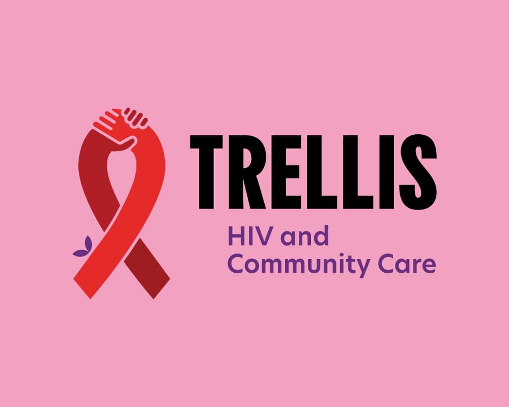
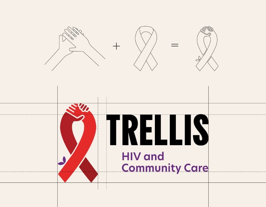
The iconic HIV/AIDS ribbon is created by two joining hands, representing the relationship between Trellis and the community. The addition of the colour purple connects the logo to harm reduction, creating a visual connection to Trellis’ service offerings.
The Story
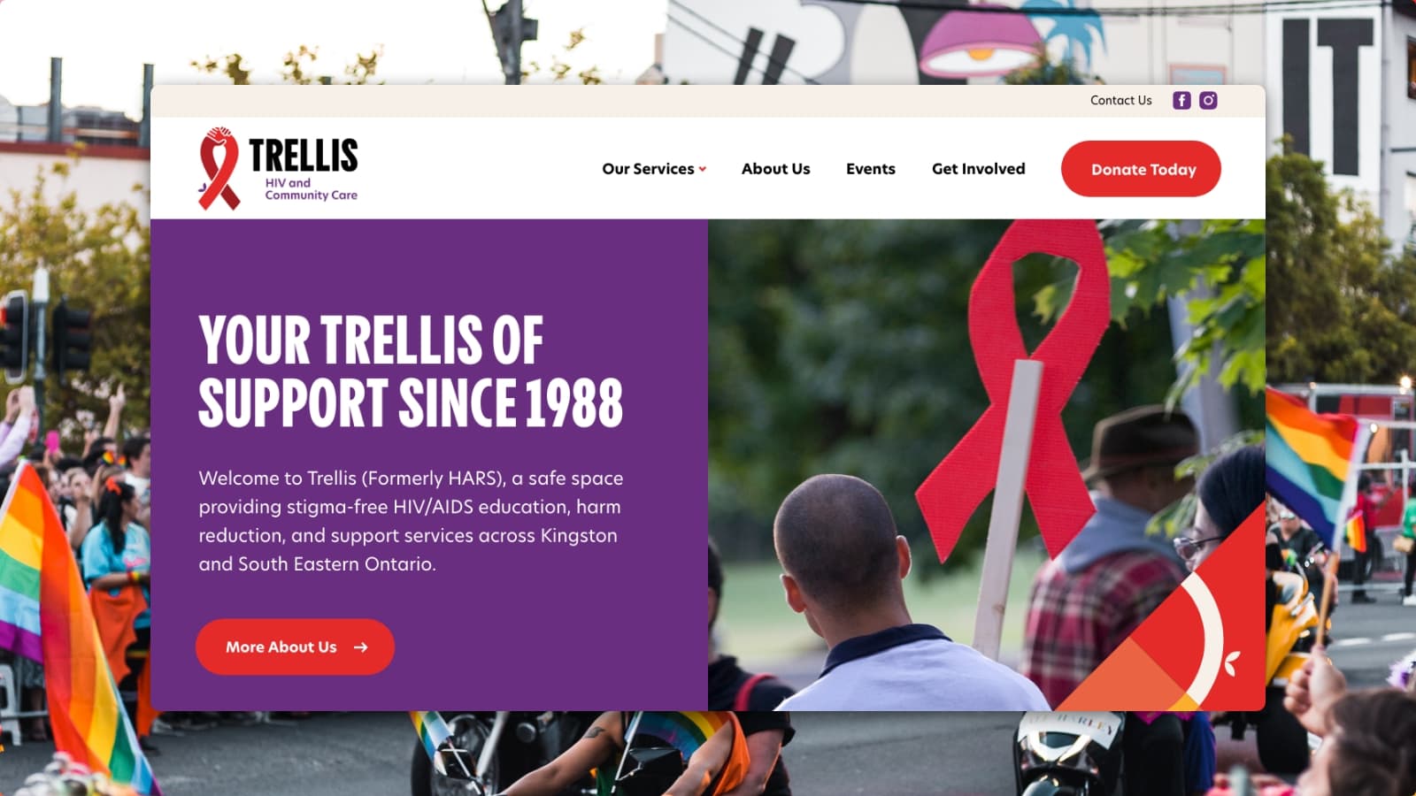
Trellis HIV and Community Care (formerly HARS) provides comprehensive services in Kingston and South Eastern Ontario including education, prevention, and support for people living with, at risk of, or affected by HIV/AIDS and other sexually transmitted bloodborne infections (STBBIs). They are committed to advocating for broader social change to reduce stigma and discrimination. Our relationship with Trellis began as a rebranding exercise, starting with a new name to better represent their growing and evolving service offerings, and ended with a new website to better engage their community and communicate their mission.
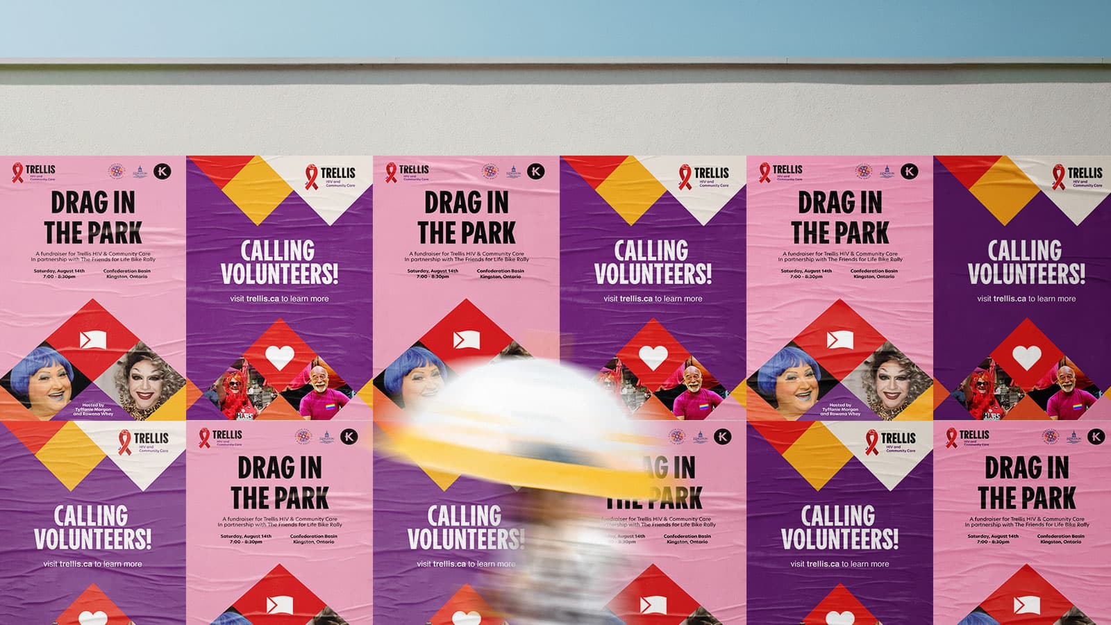
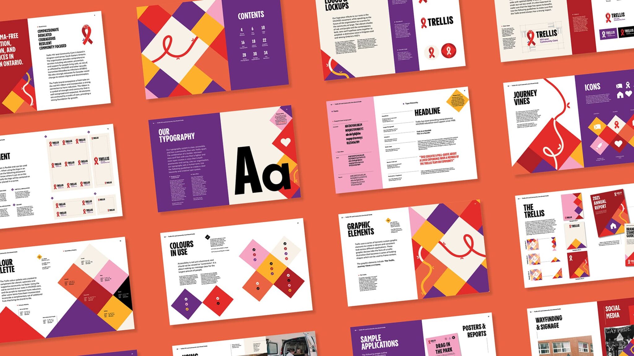
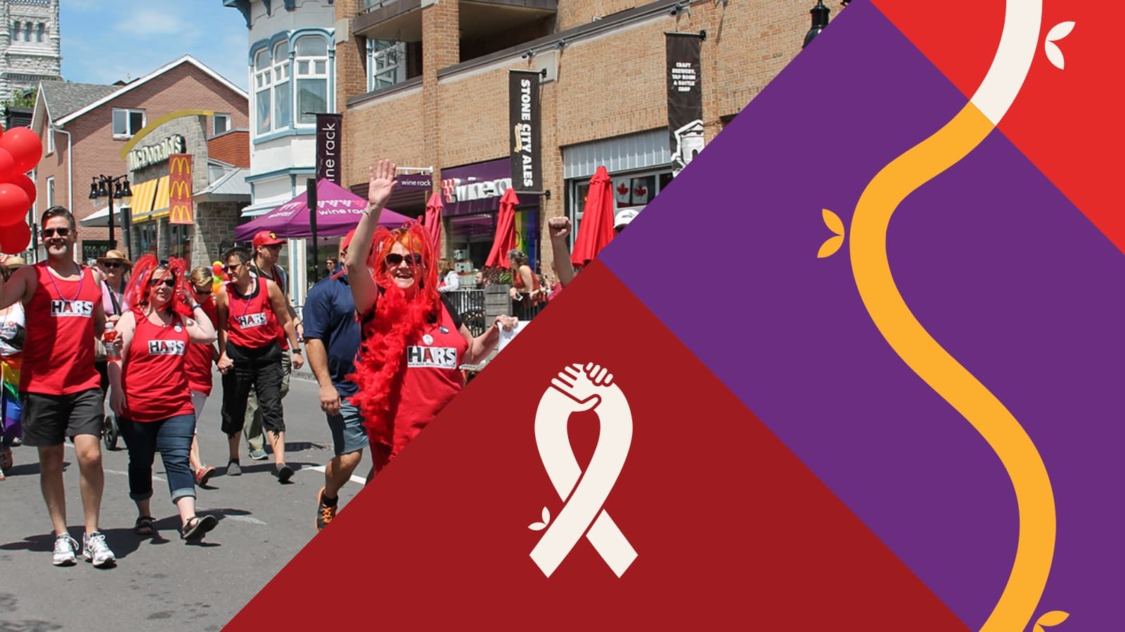
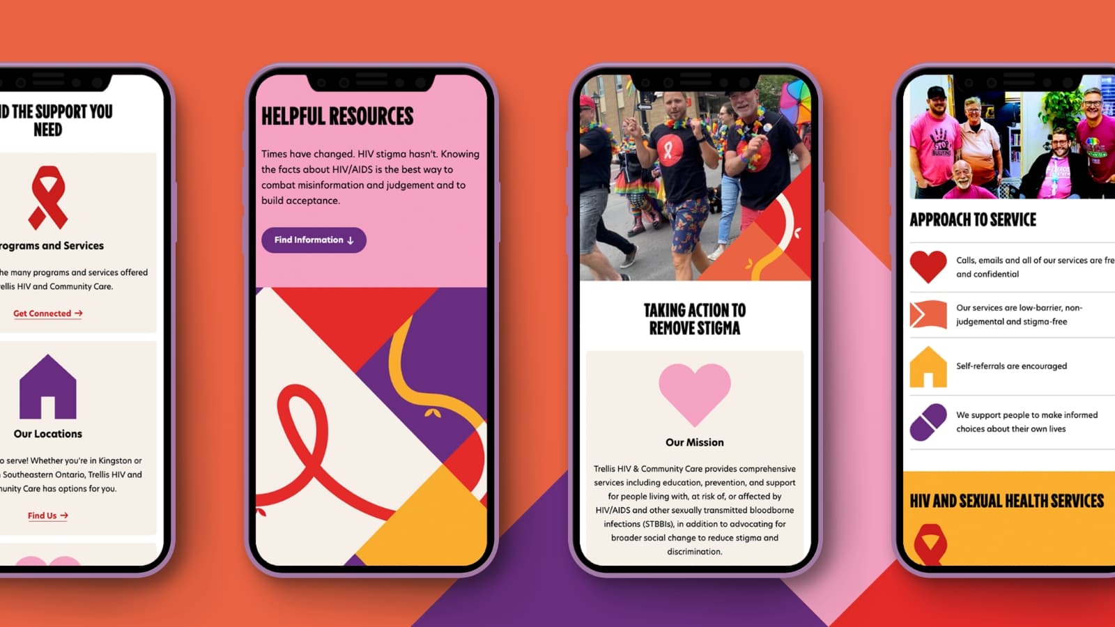
The new Trellis ribbon is created by two joining hands, representing the relationship between the organization and the community. The brand’s signature red and purple connects to both HIV and harm reduction, creating a visual link to Trellis’ service offerings. A bold and flexible graphic system, inspired by the shape and function of a garden trellis, brings the motif of growth and support throughout the brand. The trellis can be split into graphic elements that create a vibrant and consistent look across different applications. Adding a segment of the trellis onto social media posts, reports, promotions, and on the website makes for an easily recognizable brand online and offline that community members can connect with.
Sector
2SLGBTQIA+
Health Equity
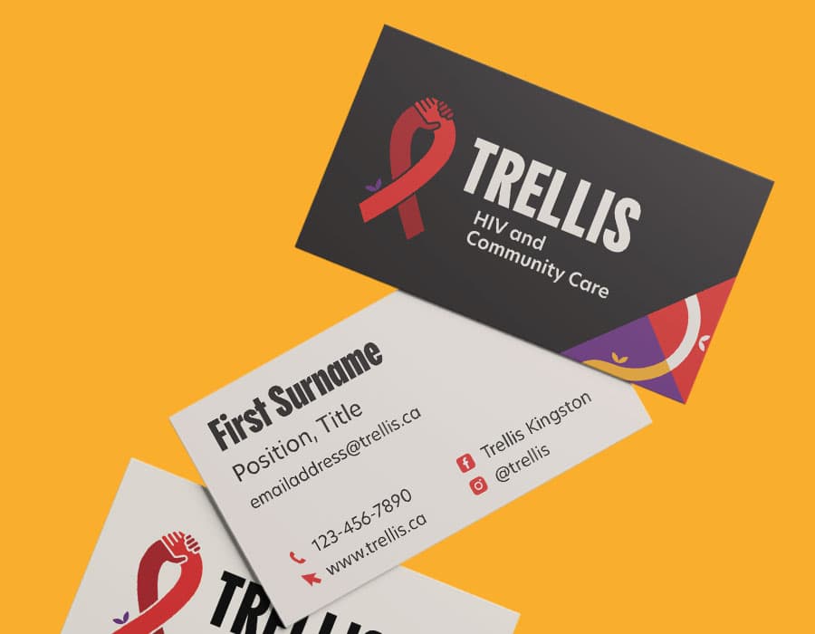
Brand Services
Naming
Logo Design
Brand Guide
Brand Collateral
Website Services
Website Brief
Style Guide Design
Mockups
Donation Embed
Redirection Map
Accessibility
Training & Support
Timeframe
8-10 months
Relationship
Since 2020
HARS logo before rebrand
New Trellis logo
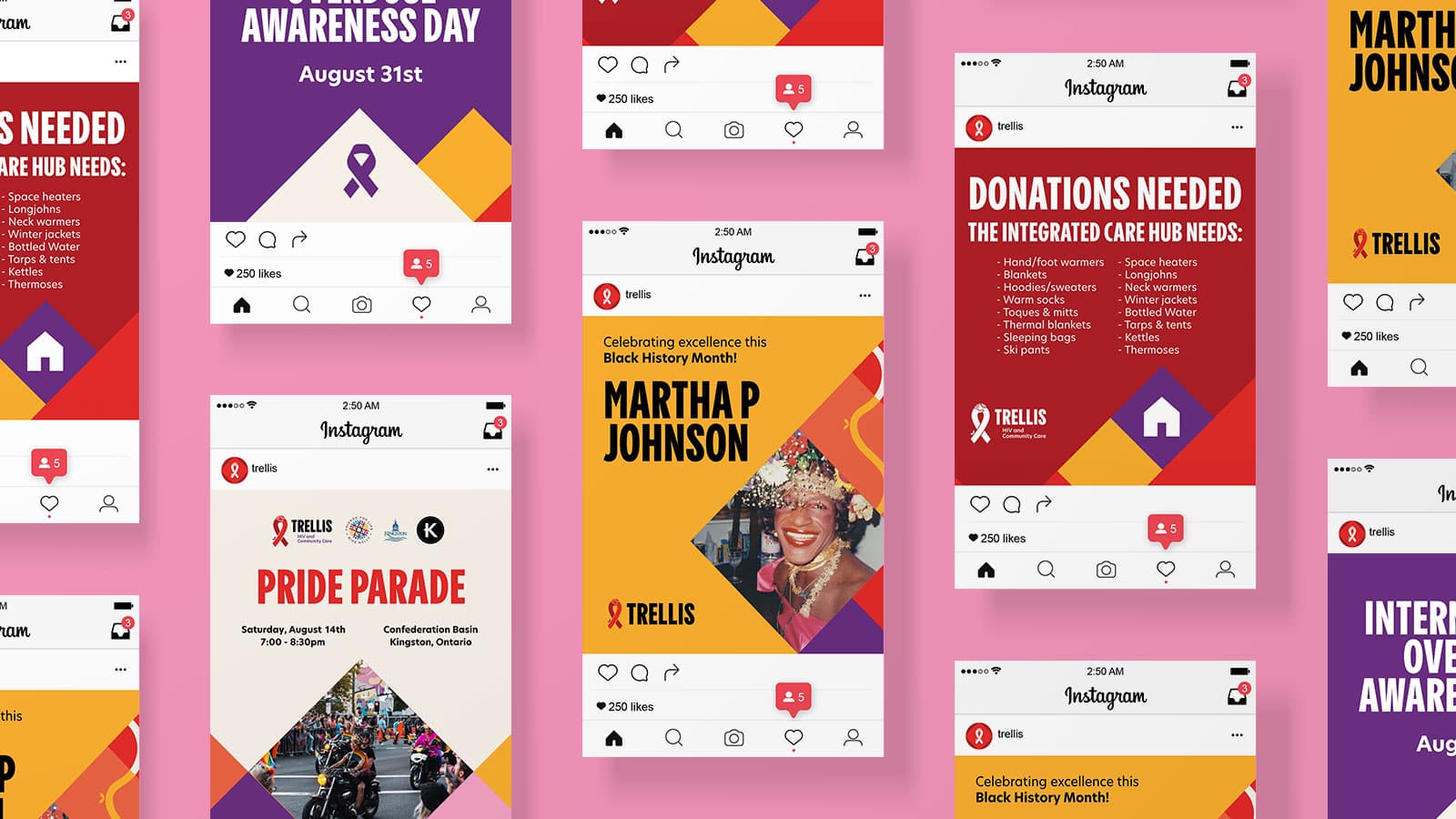
Social media is an important channel for sharing and support for the Trellis community. Extending the brand language to apply to social media posts creates a varied and engaging set of graphics that stand out amongst the rest.